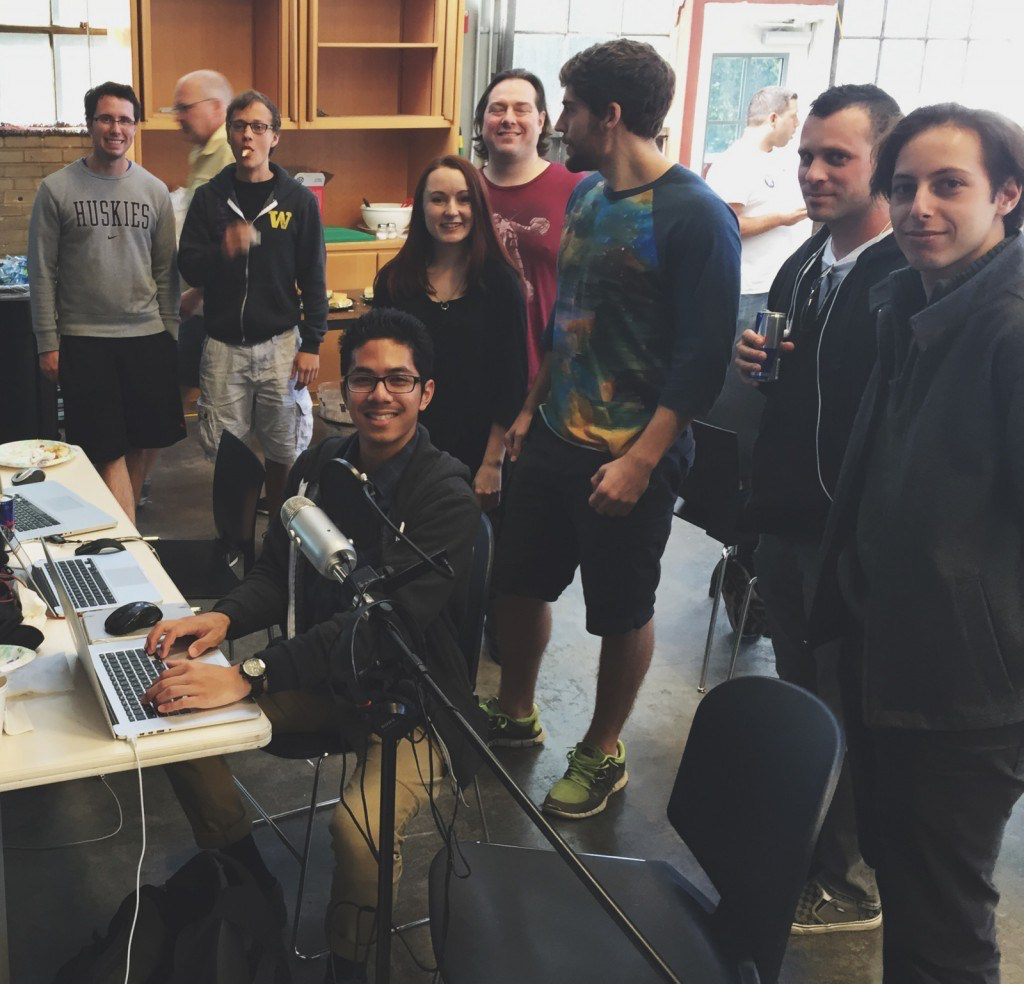
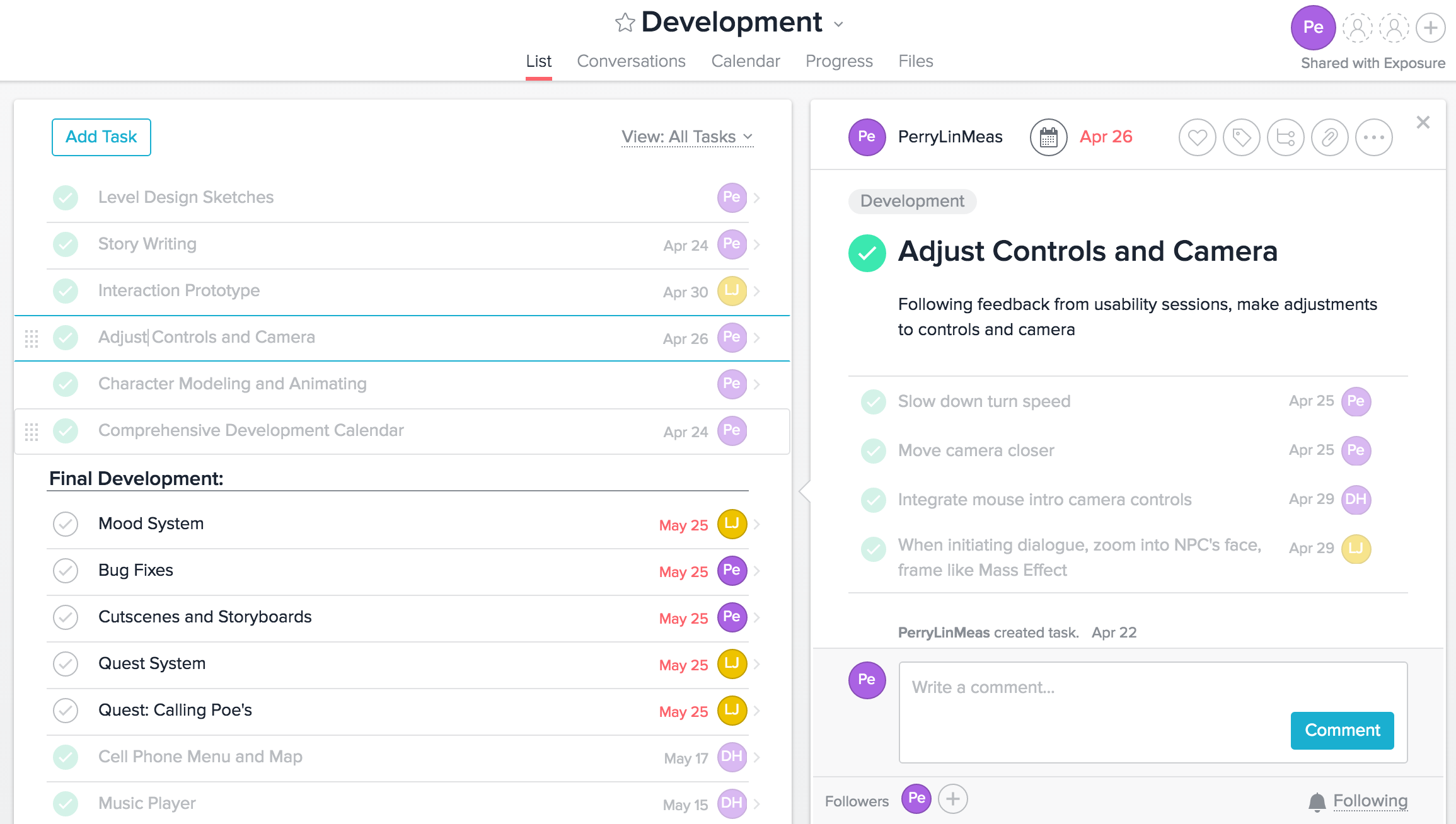
My name is Perry Meas. I am seeking roles in civic and user experience research and design. I have more than three years experience generating critical design insights for web-based platforms and consumer mobile products. I've worked as a UX research assistant for Google (via Adecco Group) on the Communications Team in Kirkland, Washington, facilitating foundational usability research for products like Google Duo, Google Messages, and Google Fi. I have two degrees in Human-Computer Interaction (HCI) from University of Washington, Human Centered Design and Engineering (HCDE) and Informatics. I am aspiring to become a civic-minded designer/researcher, writer, and media creator that merges principles of HCI and the interactive and visual arts to create media and digital products for people's needs.
In my spare time, I also devote a lot of energy and heart into learning about urbanism, game design, and economics. I also have a passion for amateur voice over work, and have devoted efforts toward a few notable indie game projects. Please contact me if you have any questions. My email is perrylinmeas@gmail.com. You may also download my resume using the link below.
Summary: Facilitated qualitative studies and concept tests for Google Messages, including features such as media-sharing, RCS messaging, and Google Assistant integration. Reported on key communication app trends to design and cross-functional partners across design, engineering, and product management. Work contributed to several launched and impending features and influenced critical initiatives and product strategy for Google Messages.
Key Initiatives
Evaluate and improve media sharing experience between Android and iOS users
Prepare Google Messages for feature launch for Rich Communication Services (RCS)
Address long-standing quality-of-life issues based on internal user feedback
Establish standards and paradigms for Google Assistant integration in Messages
My role on the Google Messages Research Team
Returning to the Google Messages Team meant I could solely focus the Messages product team's efforts to address key iniatives. I helped plan and execute remote usability studies (both moderated and unmoderated) using a variety of remote research tools (like UserZoom and Google Surveys) from start to finish. For each study, I worked with recruiters to set participant criteria, writing most of my own screeners. After executing studies, I reported back to my cross-functional team with detailed reports.
Each week, my research lead and I checked-in to discuss current work and ideas for exploratory, foundational user research. Exploratory research into users' messaging habits was especially pertinent since it was the early period of the COVID-19 Pandemic, and users were forming new communication habits amid lockdowns and quarantine orders. For example, it was important for us to examine how people were keeping in touch over both mobile devices, but also desktop and web enterprise chat platforms like Google Meet, Discord, Zoom, and Slack.
One other important aspect of my work under Google Messages was ownership of my research process and taking design leadership by advocating for the user when faced with difficult design decisions/tradeoffs. The exploratory and experimental elements of research under Google Messages meant I had to make strong cases for certain designs and discourage others that did not result in successful outcomes in studies. This was especially challenging on a cross-functional team that reflected a broad variety of opinions.
Primary Qualitaitve Research Methods
During this project, I used the following qualitative methods:
User Interviews & Prototype Testing
Remote Usability Testing
Critical User Journey Mapping
Heuristic Evaluation
Literature Review
Impact
RCS Feature Testing
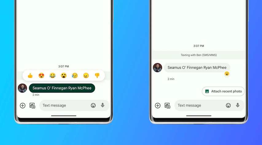
Building on prior work from Communications Rapid Research, I executed numerous prototype tests for upcoming Messages features that sought to bridge the gap between iOS and Android, and allow Messages to keep up with industry trends & standards across the product landscape. These features include message replies, emoji reactions, pinned messages, in-chat animations, improved group chat management, read receipts, and more.
Message reactions were a core part of my usability tests for Messages. Today, Messages has this relative feature pairity and continuity between iOS contacts
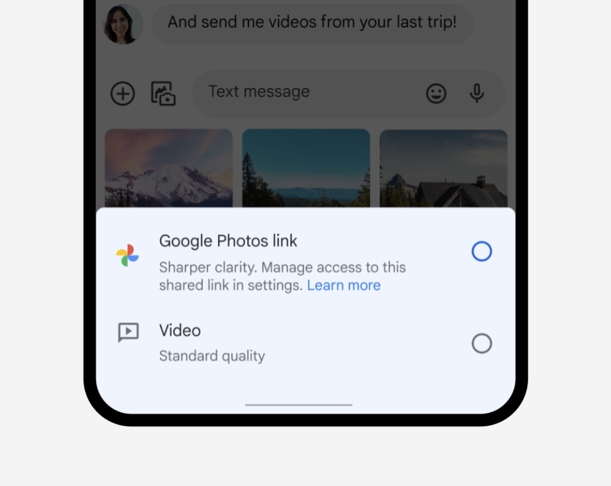
Media Sharing Improvements
I ran exploratory mockup testing for improving the quality and fidelity of media shared between iOS and Android users. This initiative involved multiple design mockups. My role was to determine how to best introduce users to our solution and gather their impressions on the mockups. From these tests, we could answer wether or not our proposed solution (integrating Google Photos with Messages) would land well with users. From each iteration of mockup tests, I identified the best elements from the design treatments to move forward with and made a strong case for choosing certain elements over others based on participant feedback.
We settled on Google Photos link-sharing to help Android and iOS users send and receive high-definition video over instant messaging
Google Assistant Integration
Evauated users' reactions to Google Assistant in Messages. Drove visual design changes to UI elements. Laid out a general map of how and when users initiate Google Assistnant in Messages.
Critical User Journey Mapping
I created in-depth and full-app user journeys and literature reviews for the emerging landscape of enterprise chat apps that were becoming a new norm in the remote COVID-19 landscape. I devoted hours into creating detailed reports on critical user journeys and features of apps like Discord, Zoom, and Slack, and identified core differences between them and Google's own enterprise platform, Google Meet. This allowed the research team to get a sense of why products like Discord and Zoom remain popular, or why TikTok was able to capture an enormous share of the short-video format market with it's key features.
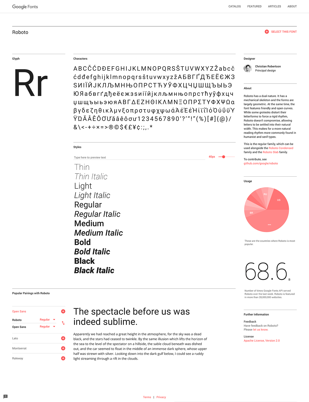
Google Fonts 2020 Redesign (via Adecco)
Role:
User Experience Researcher
Duration:
August 2019 — February 2020
Summary: Conducted qualitative research (usability studies, prototype testing, literature reviews, expert interviews) for the Google Fonts and Material Design. Facilitated weekly research presentations for cross-functional partners (engineers, designers, project managers). Efforts cleared the way for the milestone launch of 2020 Google Fonts Anniversary Redesign and new information architechture for Material Icons. Set Material Design standards for onboarding, previewing, and user documentation for new Variable Font web technology.
Project Scope & Key Questions
Prior to February 2020, the last design update to the Google Fonts website was in 2016. Since then, web font technology and digital type industry practices were moving toward new paradigms. For example, cloud font services were maturing and stabilizing across the industry and a new generation of type foundries and type marketplaces emerged as key font distributors. Google Fonts was showing its age, and user feedback pointed to critical usability and quality-of-life issues that had been long-unaddressed. Further, the type industry was exploring how to introduce Varaible Fonts to the public. Industry leaders were excited and hopeful that Variable Fonts would unleash a new wave of artistic expression and improve mobile type accessibility in web design.
To give Google Fonts the 10 year anniversary refresh it deserved, and to answer key questions about introducing Variable Fonts, my research team and I wanted to answer the following key questions:
How are consumer and enterprise users are searching for and selecting fonts across hundreds, if not thousands of options, across dozens of websites and services?
What information do users need when searching for, previewing, and selecting fonts?
What type of information architechture should we set to support the launch of new Variable Fonts?
How do educational needs for Variable Fonts vary by user role (designer v. developer)?
What do industry experts (designers, managers, typographers, marketers) think of the state and future of digital typefaces?
Primary Qualitaitve Research Methods
During this 7 month project, I used the following qualitative methods:
User Interviews & RITE Prototype Testing
Subject Matter Expert Interviews
Critical User Journey Mapping
Heuristic Evaluation
Literature Review
Key Research Projects
User Interviews – Evaluate Variable Font (VF) Onboarding
Interviewed web designers & developers to solicit impressions of existing published material on Variable Fonts and test our own sketch of what a VF previewing and introduction website could look like. We asked participants about what type of information was important to them when learning about VFs and what their knowledge of VFs were. The ultimate purpose of this study was to develop a list of starting requirements for our own Variable Font onboarding.
Remote Usability Interviews – How are users currently searching for fonts?
I led over a dozen remote usability interviews to develop a baseline understanding of how users are searching for fonts across different websites (Google Fonts, MyFonts, Dafont, etc). These interviews allowed me to identify what vocabulary and typographic terminology users rely on when searching for fonts, compare the positives and negatives of how different websites show fonts, and what barriers they face when searching, comparing, and selecting fonts.
Pre-2020, font pages were information-dense and difficult to parse through; Users wanted to use or download a font and couldn't figure out how to do this.
The existing font information tray was also difficult to understand; Users didn't know they could download fonts here or grab URLs to use fonts in their projects.
Expert Interviews & Literature Review – How do type professionals think of key developments in the industry?
We spoke with 9 type professionals (type Designers, typographers and graphic designers, advocates and influencers, business/technology leaders, professors) determine what barriers variable fonts face and what opportunities they present. I also examined papers and writings on developments in consumer VF development and marketing. From this, we developed a picture of current and upcoming trends in the type industry. This also helped us identify considerations for VF onboarding for Google Fonts.
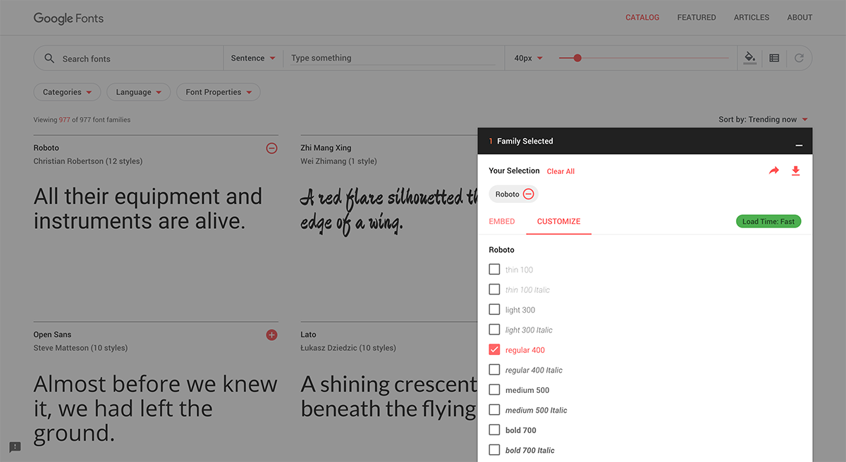
RITE Prototype Testing – What redesign will we settle on?
We ran two separate of RITE prototype studies with remote and in-lab participants using our initial redesign proposals. For the first round, we tested the early proposed redesign of the site architecture with 17 participants across three separate sessions. These tests helped us determine what elements were most important for the redesign, which elements could be reduced or removed, and which critical elements needed improvement. By the end of the first round, we settled on the core elements of the redesign.
In the second round of testing, made tested a near-final iteration and caught potential issues with the new UI. The result of this study largely drove copy changes and tweaks to interactions/UI elements.
Impact
By February 2020, the updated Google Fonts site was ready to launch. From our research findings, I was confident in the changes we were pushing forward with. We had completed dozens of qualitative user interviews and prototype tests, and the conversations with our expert interviewees gave us a solid foundation rooted in practical and professional experience.
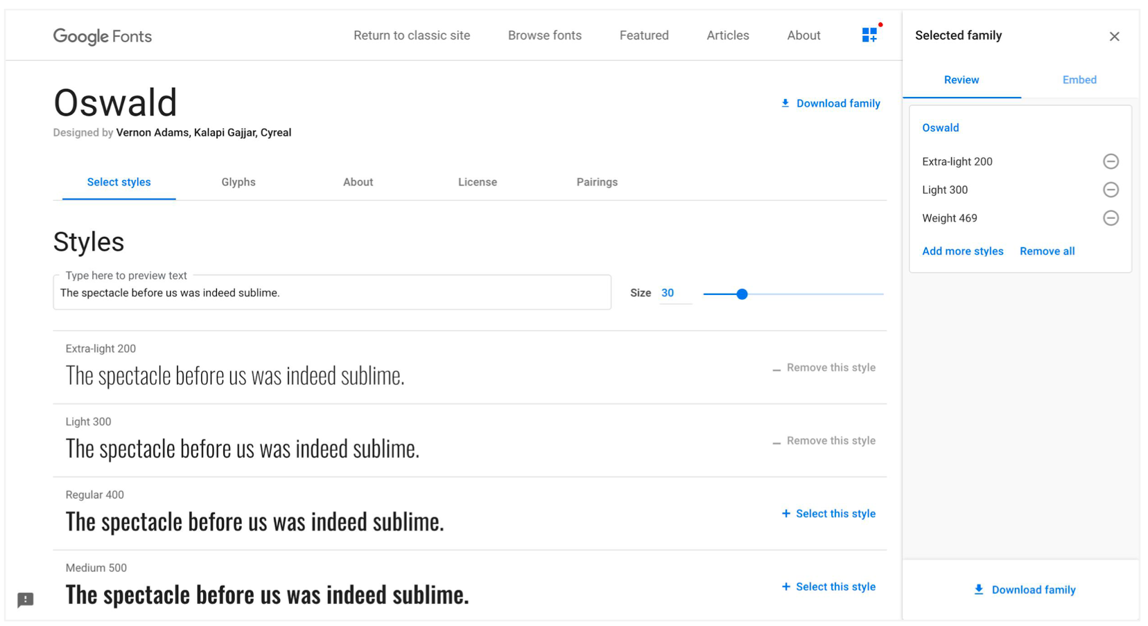
Participants could quickly locate the download button and font information on the redesigned font page.
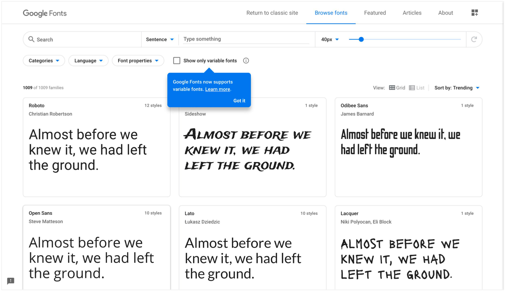
The updated home page uses clearer font cards and includes simple tooltip to direct users to information about Variable Fonts.
Validated information architechture Google Fonts website and launch of Google Variable Font technology in Q1 20202
Formed guiding design principles for displaying and previewing Variable Fonts on Google Fonts (web and mobile)
Successful information architechture updates for Google Fonts website
Today, many of these changes on the Google Fonts website are still present. Variable Fonts have gained prominence in the design world and continue to evolve. Google Fonts continues to evolve as well.
Google Communications UX Research
Role:
User Experience Research Assistant
Duration:
January 2017 — January 2019
Summary: Lightweight, rapid, qualitative user research (usability studies, prototype testing, field research, literature reviews, surveys, CUJ breakdowns) across a wide suite of messaging and calling consumer apps and related products. Executed 65+ studies for products such as Google Messages, Google Duo, Google Fi, Google Photos, and Allo on mobile, desktop, and tablet platforms. Helped lead foundational research initiatives into consumer communication habits across the United States and abroad. Findings led to major feature launches and countless quality-of-life changes for messaging and calling products.
About my role on the Communications Rapid Research Team
As a research assistant under Google Communications, I planned, executed, and reported on qualitaitve studies for consumer messaging and calling products such as (but not limited to) Google Messages, Duo, and Dialer. These research projects supported borader efforts to drive user growth and improve user retention for many of these maturing Google products.
The Rapid Research Team was an initiative to increase lightweight, tactical design research in addition to provide extensive support for larger research projects that require scaled-up field teams. For example, in one period I would run rapid-iterative tests and new feature prototype evaluations dozens of in-lab or remote participants; in the next period my team and I would conduct street interviews with public participants; and in another period we would be traveling across the United States learn about people's communication experiences and challenges across various social and economic divisions. This gave my cohort and I a wide experience of qualitative research in all sorts of formats and research questions.
Core Product Work
Instant Messaging – Messages & Allo
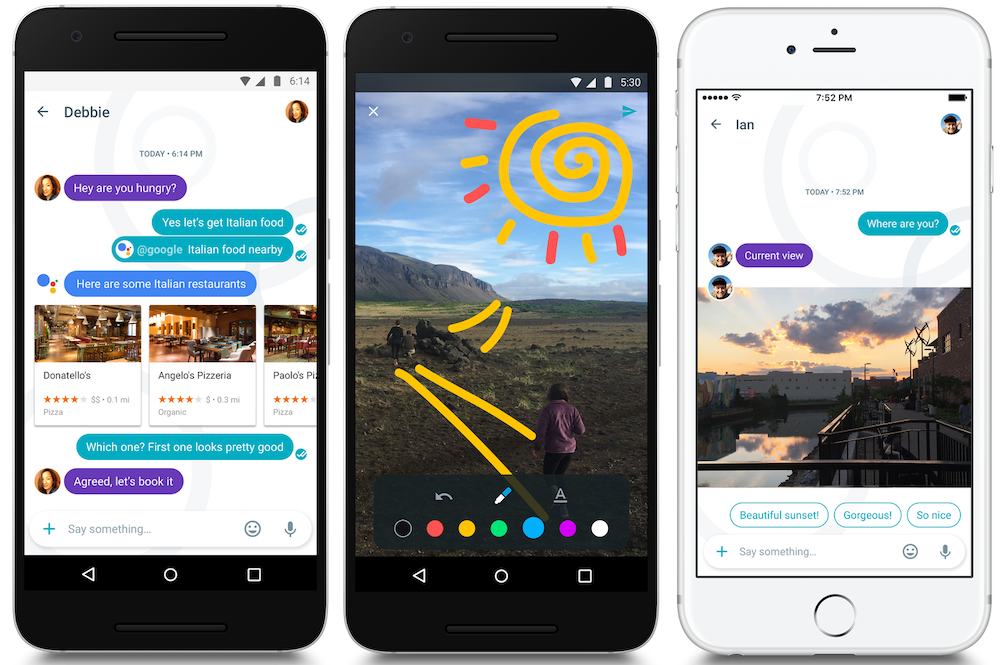
A large proportion of my work under Rapid Research went toward developong the instant messaging experience on Android. Communications was interested in not only driving up adoption for Google Messages (then known as Android Messages) and Google Allo, but also exploring new features to help them stand out to competitor platforms, and provide a high-quality base messaging experience available to all Android users. I conducted numerous usability prototype studies testing improvements to existing features and gauge the viability of novel ideas. The typical methods ranged from in-lab moderated studies, to remote unmoderated studies, and I became expertly familiar with our lab tools and web testing platforms.
In many instances, I ran field intercepts with participants across Seattle to get their impression of new concepts and even "zany" ideas to make instant messaging on Android more fun and engaging
This research greatly impacted the Messages and Allo product teams and gave the team a window into what our users were thinking. Some features I contributed toward are now considered standard in Google Messages today. These include:
Google Assistant Integration
Google Messages Desktop Client
Expressive Stickers and Message Animations
Message Sorting and Spam Management
While Google Allo is gone, the work we did served as a basis for important features (such as read receipts and Google Assistant) that live on in Google Messages
Calling & Video Calling - Duo
At this time, Google Duo was just emerging in the video/audio calling product landscape. The Duo team wanted to deliver a simple, high-definition video chat experience over broadband and compatible between Android and iOS. I conducted numerous usability tests for improving call quality, reducing latency, and preventing call drops. My primary research methods were moderated prototype/mockup and beta tests, supplemented with field intercepts and critical user journey mapping.
My research raised general usability problems to the forefront. My usability studies also helped the Duo Team, building a relatively new product on the market, feel confident in moving forward with additional feature expansions over the years. I summarize my impact toward Duo as supporting the following:
Launch of Data-Saving Settings
Launch of Audio-Only Calling on Duo
Tested Video Quality Bandwidth Adjustment
Conducted Early Evaluations for Group Calling
General Quality-of-Life and Usability Improvements
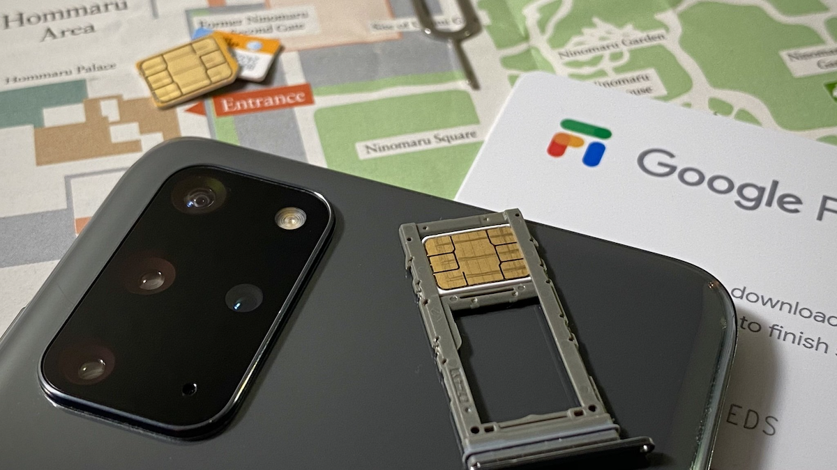
Telecom Service Experience – Google Fi
I worked with the Google Fi team (then known as Project Fi) at a critical juncture in their product lifecycle. At the time, Google Fi was aiming to grow a wider user base targeting consumers who needed a reliable and flexible cellular data plan. In order to offer a phone plan for everyone, the team needed to make major changes to the onboarding and account management user journeys. My usability research with Fi centered around the need to make the entire new user onboarding process as simple and easy to grasp as possible. I tested dozens of different prototypes and mockups for the Fi setup and account management experience.
We tested physical Fi setup instructions for smartphones; I moderated many of the interviews where we asked participants to setup Google Fi on their device. These tests were critical to finding issues or gaps in the new Fi user setup experience
My work was especially helpful for the UX and content writers–everything from illustrations, images, and user guides, to the setup instructions and copy was subject to reexamination. My overall impact with Google Fi involved:
Simplified New User Onboarding and Device Setup Flow
Adjustments to User Guides, Verbiage, and Copy
Launch of Data Sharing and Data Management Functions
Fixes to Account Management Functions
Early Marketing Feedback of New Billing Plans
Foundational Exploratory Research
I was part of major iniatives to develop foundational knowledge about people's mobile communication habits, challenges, and needs across a broad section of the US and world population. For this iniative, Communicatons sent teams across the United States and worldwide to survey and interview participants from everyday walks of life, across generational gaps, and economic divisions. I traveled with one section of the team across the country to meet with participants in rural, suburban, and urban areas. This gave us invaluable data about key user needs and issues (for example, the experiences of families in rural Illinois trying to stay in touch with loved ones in areas with poor cellular reception and limited broadband internet access). I conducted or notetook for many of these interviews and participated in multi-team discsussions about overarching themes and key points. These discussions then led to design proposals that benefited the entire Communications product suite.
Sandwich, Illinois was one such town that my research team and I traveled to and met with everday folks to learn about their mobile communication experiences
Impact
Research pushed forward dozens of major feature launches and improvements for Messages, Duo, Fi, and Allo
Presented hundreds of hours of evaluative and exploratory user studies across mutliple product teams
Built an extensive library of detailed foundational research into consumer communication needs and habits
Mentored new research assistants and served as a technical resource for fellow research partners
Built strong, collaborative team culture among research assistant cohort
Produced high-quality graphics, audio, and videos for dozens of research reports
Google Duo (via Adecco)
Role:
User Experience Research Assistant
Duration:
Winter 2017 — Winter 2019
Summary: Improved video calling experience for Google's video calling mobile app through mixed-methods qualitative user research (e.g. lab prototype testing, heuristic evaluations, intercept field studies). Determined users' pain-points and needs by eliciting direct feedback. Presented insights to cross-functional stakeholders (engineers, designers, project managers) to drive product strategy. Tested and evaluated solutions to pain-points as well as new video calling features.
About
Google Duo is a cross-platform mobile video calling app offered under the Google Communications product suite. I learned how people and their loved ones stayed connected via video/audio calling and what challenges/pain points they face when doing so.
Impact
Our evaluative research ensured that the onboarding experience for Duo as well as the calling experience was simple and easy to grasp for new users. Research insights also validated new features intended to improve call quality and reduce latency and call drops. Long-term exploratory projects gave us an understanding of how and when different people may video call one another (e.g., for how long, with whom, for what purposes, in what settings, what places, etc.). I strove to understand the contexts that drove peoples' video calling behavior.
Google Fi (via Adecco)
Role:
User Experience Research Assistant
Duration:
Winter 2017 — Winter 2019
Summary: Improved flow of customer sign-up, setup, and dashboard for Google's mobile telecommunications service by directly engaging with customers and prospective users through mixed-methods qualitative user research (e.g. lab prototype testing, heuristic evaluations, literature reviews).
About
Google Fi is a cellular telecommunications service offered under the Google Communications product suite. Fi is a customer experience and journey that spans across devices and platforms and involves a lot of interesting design challenges and opportunities.
As a User Research Assistant under Communications, I planned and facilitated mixed-methods qualitaitve user research to evaluate the key platform flows and understand customers' pain points in the service sign-up, setup, and service maintenace process. I worked with designers and project managers to understand the strategic and tactical goals of Google Fi and how they would evolve over time. My understanding allowed me to design and plan effective studies and experiments for the aspects of Google Fi we worked on. I became acquainted with Google Fi's brand language and design patterns, which allowed me to establish a common language with other Google Fi stakeholders.
Under the Comms Rapid Research Team, projects consisted of short-term tactical lab studies used to quickly gather answers and feedback on new designs and solutions for the Google Fi customer experience, as well as long-term field studies that involved weeks of preparation, execution, and analysis. These studies involved engaging with external participants which allowed us to develop a relationship and raport with our customer base.
I had the chance to develop a broad mastery of different research methods. For Google Fi, I conducted moderated lab studies with participants to test and validate the signup, onboarding, and dashboard experiences. Long term interview and field studies sought to understand the phone service lifecycle.
Impact
Following each study, I presented insights to cross-functional partners in engineering, design, and organizational leadership. During these presentations, I advocated for participants’ perspectives by focusing on successes, pain points, and underlying contexts driving their behavior. I also examined product lifecycles and mapped user journeys. Following these presentations. I even had opportunities to facilitate design sprints and workshops involving these cross-team stakeholders to envision ideas and solutions to the usability gaps my research work uncovered.
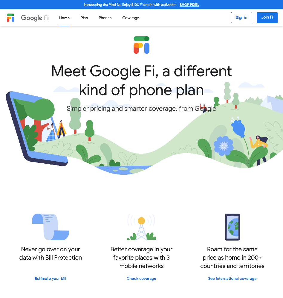
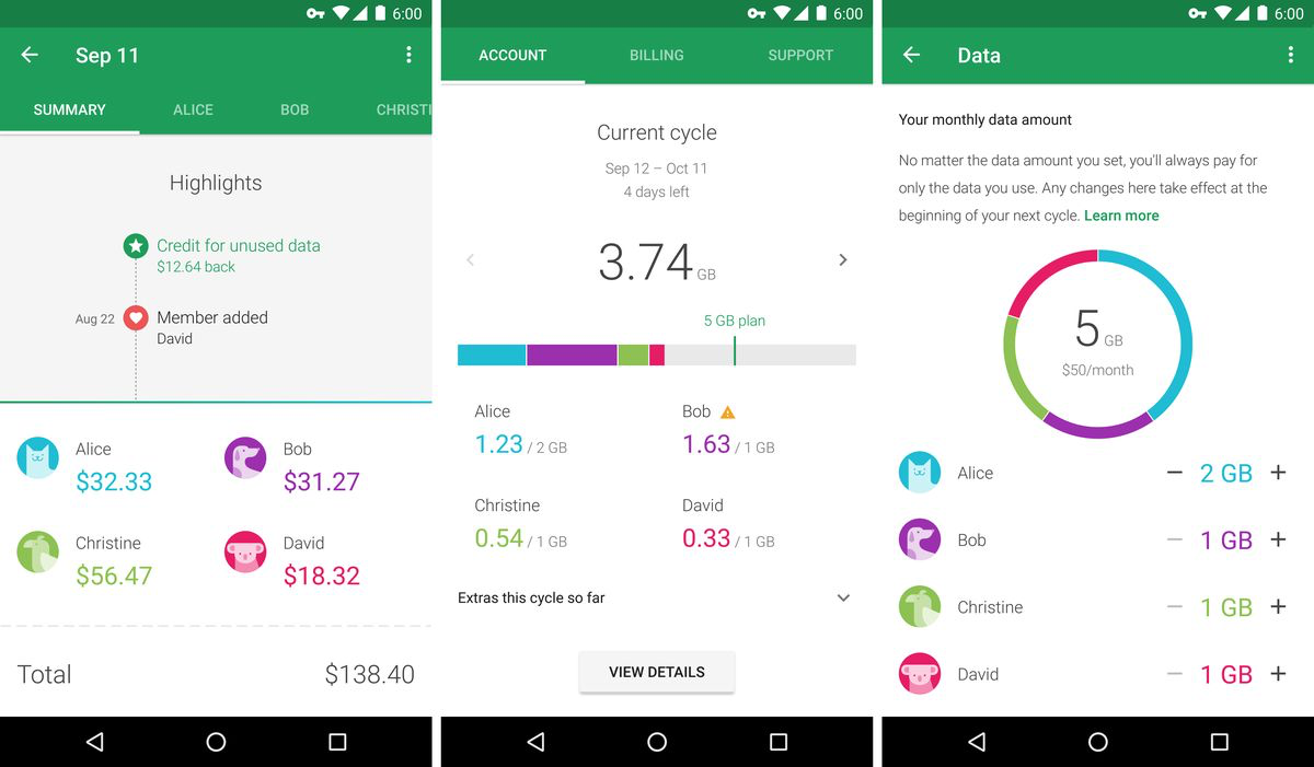
We studied where customers first explored on the Google Fi home page.
My work around the customer signup/setup experience made sure steps and instructions were digestible and understandible for customers starting Google Fi for the first time.
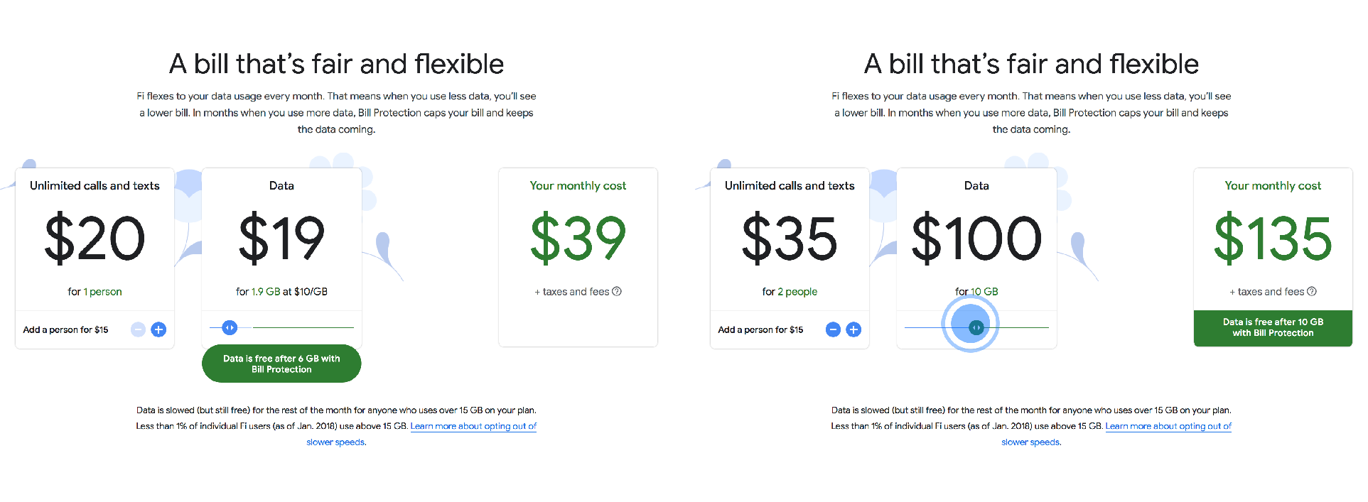
A slider (highlighted in blue) intened to help customers estimate their maximium monthly bill.
The Google Fi website has many features to help customers understand how Fi works.
The mobile service dashboard app was also a large component of the whole Google Fi experience.
Everything from the illustrations, images, and use-case examples used in-app, to the instructional language and copy was subject to examination and criticism. My recommendations were especially helpful for the UX and content writers who needed to understand where users were struggling with the whole Google Fi customer experience. This ensured that the whole experience was unified from sign-up, setup, and service maintenace.
I brought my multi-media and writing skills to communicate users' stories
To effectively share users' perspectives, I made dozens of video and audio clips from sessions. These were critical for helping stakeholders empathize with users' perspectives, successes, and pain-points, and enabled us to make effective design decisions.
My insights prompted actionable recommendations and next steps, propelled product decisions, built institutional-wide design patterns, and shifted informed organizational-level strategies at Google.
This was but one of the many Google Communications products I worked on
I conducted user research for all consumer mobile products under the Comms umbrella and many more across Google. These included:
SMS/OTT messaging apps like Android Messages
Video/audio calling platforms like Google Duo
Photo sharing apps like Google Photos
Never Alone Control Scheme
Project Type:
Interaction Design Mockup
Duration:
Spring 2015
Summary: An exercise to envision a revised control scheme for players of the 2014 game, Never Alone, who have motor impairments associated with Parkinsons's Disease. I served as an Interaction Designer and Researcher. This project used existing research on interaction design for users with motor impairments to guide many of our design decisions. It gave us an opportunity to consider a user group normally overlooked in commercial interaction design.
The Problem
Video games that require quick, complex movements with a keyboard and mouse or other type of controller are often inaccssible for players with motor impairments. For a class in interaction design, a group of three classmates and I designed a revised control scheme for the 2014 game, Never Alone, for players with motor impairments associated with Parkinsons's Disease.
My Role
As an interaction designer and researcher, I worked primarily on prototype sketches, brainstorming of the control schemes using affinity diagramming, content analysis, and existing usability research, and the writing of project documentation
Research Activities and Findings
In the early stage of the project, we explored existing research on interaction design solutions for people with motor impairments. These impairments result from mechanical or motor-neuron diseases that limit peoples' degrees of movement, hand-eye coordination accurace, and speed. Most people with impairments rely on simplified interpretations of an existing interface to interact with touch-based systems. This means larger touch areas and buttons that increase the probability that a user will select the correct one. Styluses are also used to aid in acquisition of on-screen targets. In many of the papers and design studies we read, the common theme was to simplify interfaces with enlarged target areas that controlled basic functions. Our main consideration was Fitts' Law, motivated our using large touch areas to reduce the amount of time and effort it takes for players with limited mobility to acquire and reach such controls.
We took these prior findings and attempted to adapt them to Never Alone's PC control scheme:
Design Solution
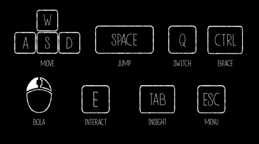
From consulting secondary research, our design solution took the form of a video prototype and visual mockup created in InvisionApp using a tablet and stylus with an additional four button control pad as the hardware. The stylus controller is intended to allow the player to have steady control over interactions with less strain on their muscles.
The tablet controller with stylus uses large touch zones to direct movement such as running and jumping. These large zones make it easier for players with Parkinson's Disease or other fine motor impairments to reach control targets without the need for precision and muscle strain. The four button control pad is used for context specific controls such as ducking and covering and activating game menus. The pad, which uses a smartphone for the mockup, also uses large targets under the same principles as the tablet. Players can press buttons using their preferred hand with less precision and effort.
Examples of the controls we designed the with an accompanying animation and video can be seen below:
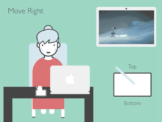
Demonstration of the directional Movement controls. Players can drag and point with the stypus to any one of the four edges of the control pad to move the character left, right, up, and down.
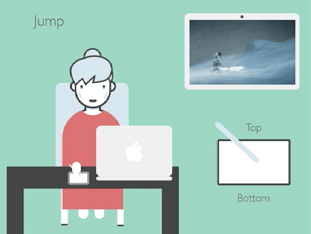
Demonstration of Jumping. Tapping on the control pad with the stylus will cause the player to jump. The four corners of the pad are also used to allow the player to jump in a horizontal direction.
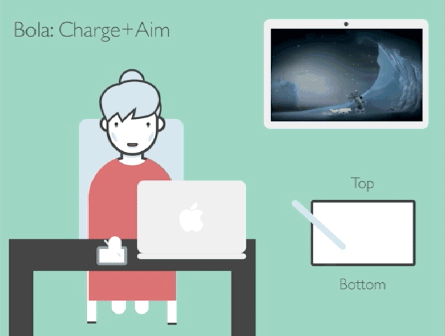
Demonstration of the Bola Charge + Throw. Players can throw a slingshot projectile by using the 'V' shaped Charge gesture followed by a directional drag and point to Throw the projectile in any direction.
The full set of video prototypes intended to capture the general concept of our interaction scheme are as seen below:
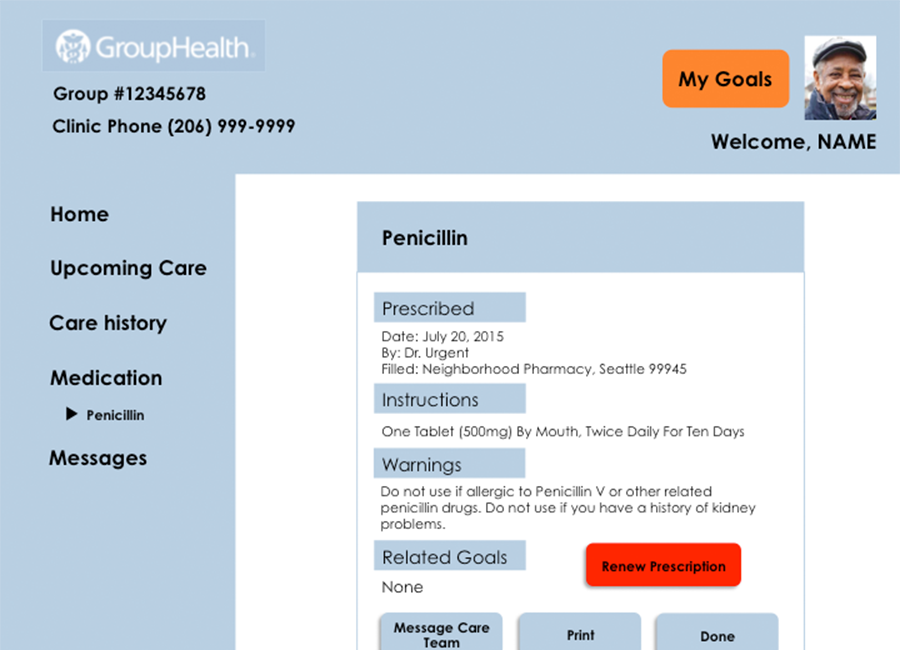
iMed REMIND - Patient-Centered Design Research for Group Health Research Institute
Project Type:
User Experience Research and Design for Medical Systems
Duration:
Summer 2015
Summary: A design research project to create an improved patient-facing, web-based healthcare management system. Over the summer of 2015, I worked as a User Experience Design and Research Intern for Group Health Research Institute and the UW Information School. The results of this project were published and presented to the American Medical Informatics Association.
In summer of 2015, I worked as a user experience research and design intern for iMed's REMIND Project, a joint-project between Group Health Research Institute (GHRI) and the UW iSchool iMed Research Group. The REMIND Project focused on using patient-centered design to produce a front-facing application intending to help Group Health patients better-manage their healthcare. This application is a redesign of Group Health's existing patient portal, MyGroupHealth. This project involved a team of UW undergraduate and PhD students, UW faculty, and Group Health medical professionals.
The Problem
Patients who manage chronic illness (such as those with diabtetes and motor-impairments) have difficulty navigating web-based care management systems because of poor design and complex user flows. Using these systems, both mobile and web, require major time committment and effort, which discourages usage and care management. Also, existing systems were historically designed to meet medical service providers' business and operational needs rather than patients'. As such, features may be burried in complex user flows and use unfriendly language for medical patients.
iMed aims to redesign such a system to be more patient-centered, to give patients a sense of control over their care and their health.
My Role
For this project, my primary responsibilities as a user experience design and research intern was to develop mockups and prototypes for a system serving our core users: medical patients managing chronic illness. I was to use existing research on patient-centered interaction design to help design and plan a research study to evaluate the designs I created. During research sessions, I both facilitated participants and took notes. I would then use the detailed information gathered from interviews to make changes to the design and test again until we reach data saturation. We would document our findings in a final report as well.
Initial Research
As a new member on this project, I reviewed existing literature on designing for medical patients and reviewed requirements gathered during the project's previous year. I also met with the Group Health medical staff to understand their perspective and stakes in the project. I took careful notes of important principles and requirements during my initial research.
Once I was up-to-speed with the project, I immediately switch to conducting UX design work. My first step was to outline a basic user-flow for the application, keeping in mind the high-level functions the applications needs to support.
Rapid Prototyping
I then created low-fidelity prototype sketches of the redesigned interface.
The low-fidelity sketches I created were then iterated upon and adapted into digital mockups.
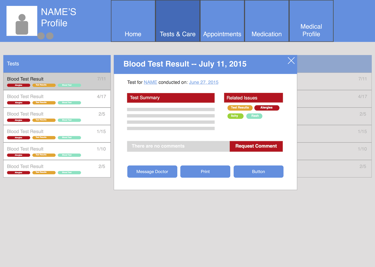
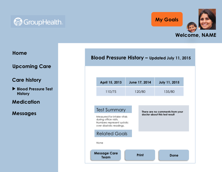
Once the mockups were created, my partners and I conducted live prototype usability tests with real patients from a diverse cohort to test and evaluate the efficacy of our designs. These tests consisted of scenario-based tasks and semi-structured interviews to elicit feedback on the design. The participants' ability to complete the task using our design was the benchmark in which our design was evaluated. The semi-structured interview portion was used to give participants time and flexibility to reflect on the task and design. Study participants provided great feedback on our first prototype and allowed us to identify where our design failed to meet their needs. We produced two more prototypes and conducted many more studies till we produced a final design. The evolution of the design is as follows:
Results and Findings
In early iterations of the prototype, many patients we interviewed had difficulty completing our task-based usability scenarios. These scenarios involved anything ranging from sending a message to their care provider, to checking the instructions of a specific medication. Patients were also instrumental in identifying langauge used in the prototype that did not match their mental model.
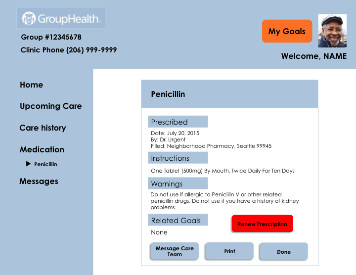
For example, in one usability scenario, patients were asked to use the prototyped system to locate their past medical test results. In early prototypes, this information lived in the section labeled "Tests and Care". Many patients found this labeling to be vague, and we changed "Tests and Care" to "Care History". After this change among others, we noticed a measurable increase in task completion.
Overall, patients found our prototype's simple design to be a refreshing change from complex or poorly designed existing systems. Instead of a bloated web page or portal, we presented an interface which used clear language and large, simple buttons and click areas for patients to identify and navigate to.
By the project's end we synthesized our findings in a paper published and presented with the American Medical Informatics Association. Group Health's engineering team also incorporated our findings into the next iteration of the design of their patient-facing care management system which continues today.
Reflections
iMed REMIND was a wonderful exercise in both user research and design. I worked in every facet of the design process, not only doing researh and design, but also working on a team of fellow students and faculty, as well as domain professionals. It proved to me that I am capable as both a researcher and designer; that I have a set of well-rounded skills; that I have the flexibility to comfortably engage at every level of a design process.
PILLars of Unity: A Two-Player Virtual Reality Collaborative Puzzle Game for the 2015 Seattle Virtual Reality Hackathon
Project Type:
Virtual Reality Game Development
Duration:
2 Days, Autumn 2015
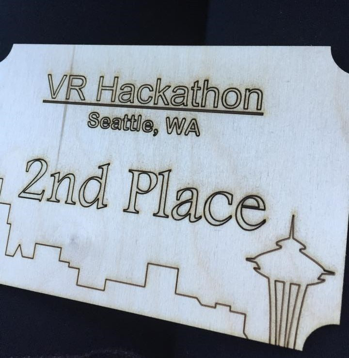
Summary: A two-player virtual reality collaborative puzzle game built in Unity3D during the 2015 Seattle Virtual Reality Hackathon. On a team of nine, I served as an Experience Designer, Level Designer, and User Researcher. For our work, we earned Second Place for Best in the Show.
PILLars of Unity was a two-player collaborative virtual reality puzzle game prototyped at the 2015 Seattle Virtual Reality Hackathon. The objective of the game was to encourage players to communicate effectively to succeed. Two players with VR headsets had to navigate puzzles in which one player could see game elements that the other could not and vice versa. On this project, I served as a game mehcanic and level designer on a team of nine. Among my team members were my good colleagues Max Schreiber, one of our Unity3D developers and artists, and Eva Horeth, who worked with me as a mechanic and level designer. Together, the nine of us would put together a prototype of a novel virtual reality experience within 24 hours.
My Role
As a level and game designer, I worked with Eva to develop the main mechanics as well as the layout of each stage. Designs evolved from a short list of brainstormed requirements, into 2D sketches and mockups, and then the final 3D design built in Unity3D. I helped monitor the level design process in Unity as the developers went forward in the design. I advised our developers on the placement of certain assets or details in the game world. Toward the end of the project, ideally, Eva and I would also try and conduct playtest studies to evaluate our design.
Design Activities
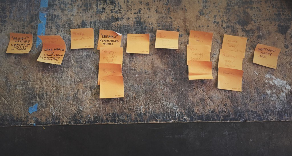
We generated as many ideas on stickynotes and selected which ideas, themes, or features we could adapt into the game.
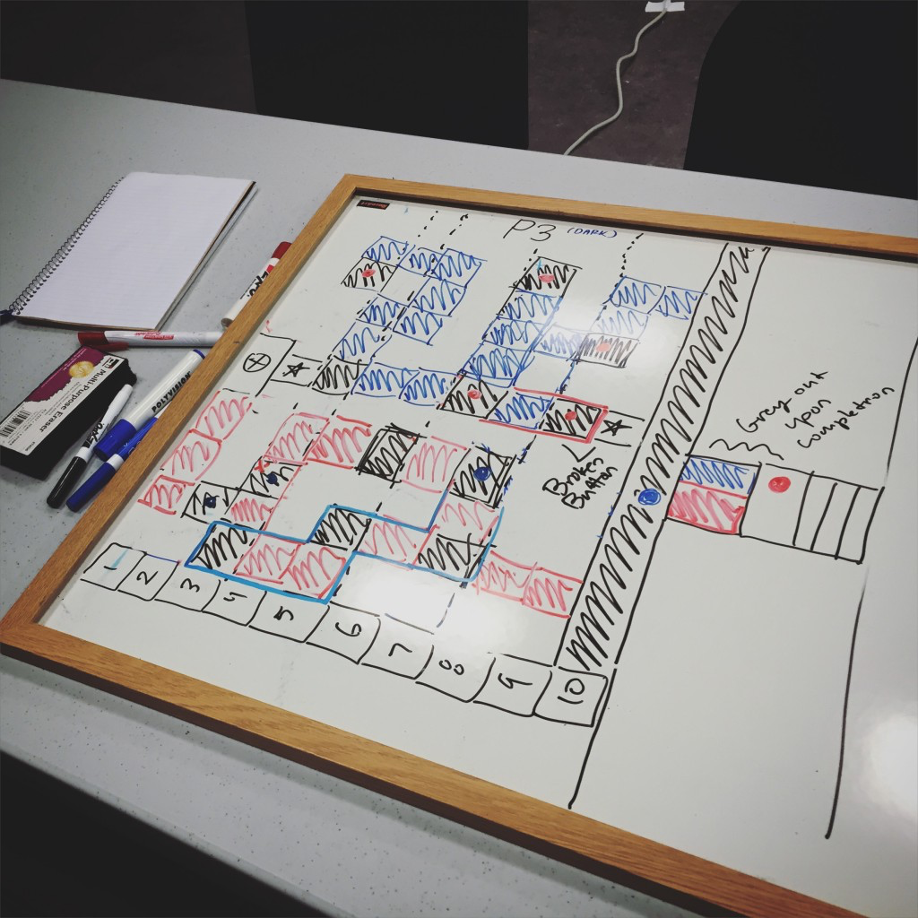
Once we had the general concept of the game on paper, Eva and I used whiteboarding to visualize the puzzle and level designs.
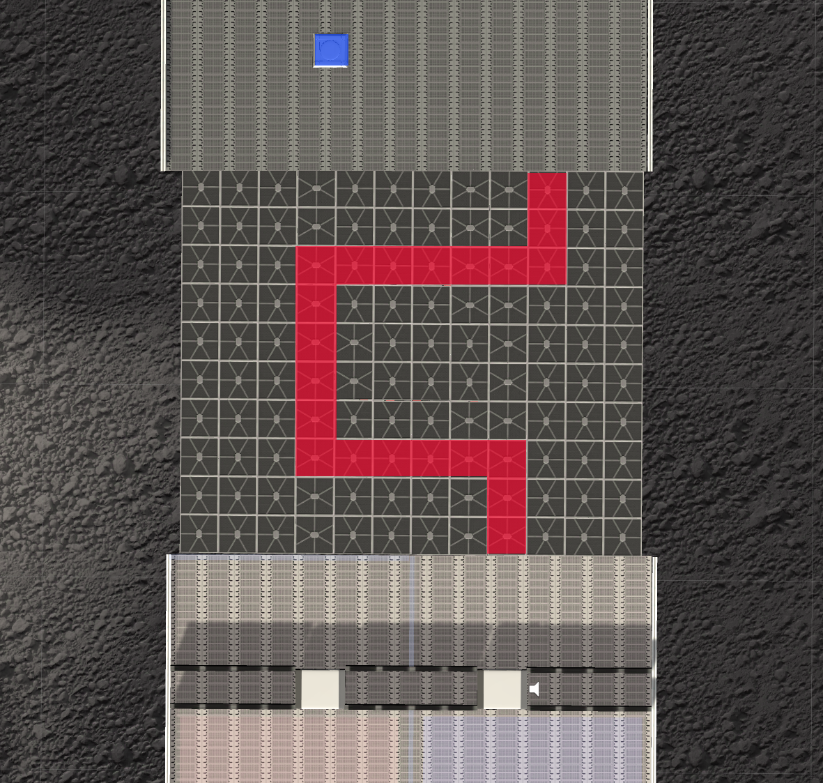
Players would navigate mazes and labrynths and activate color-coded switches and buttons that would help advance them to the next stage. All the while, players would help guide one another when they come across different obstacles that only they could see.
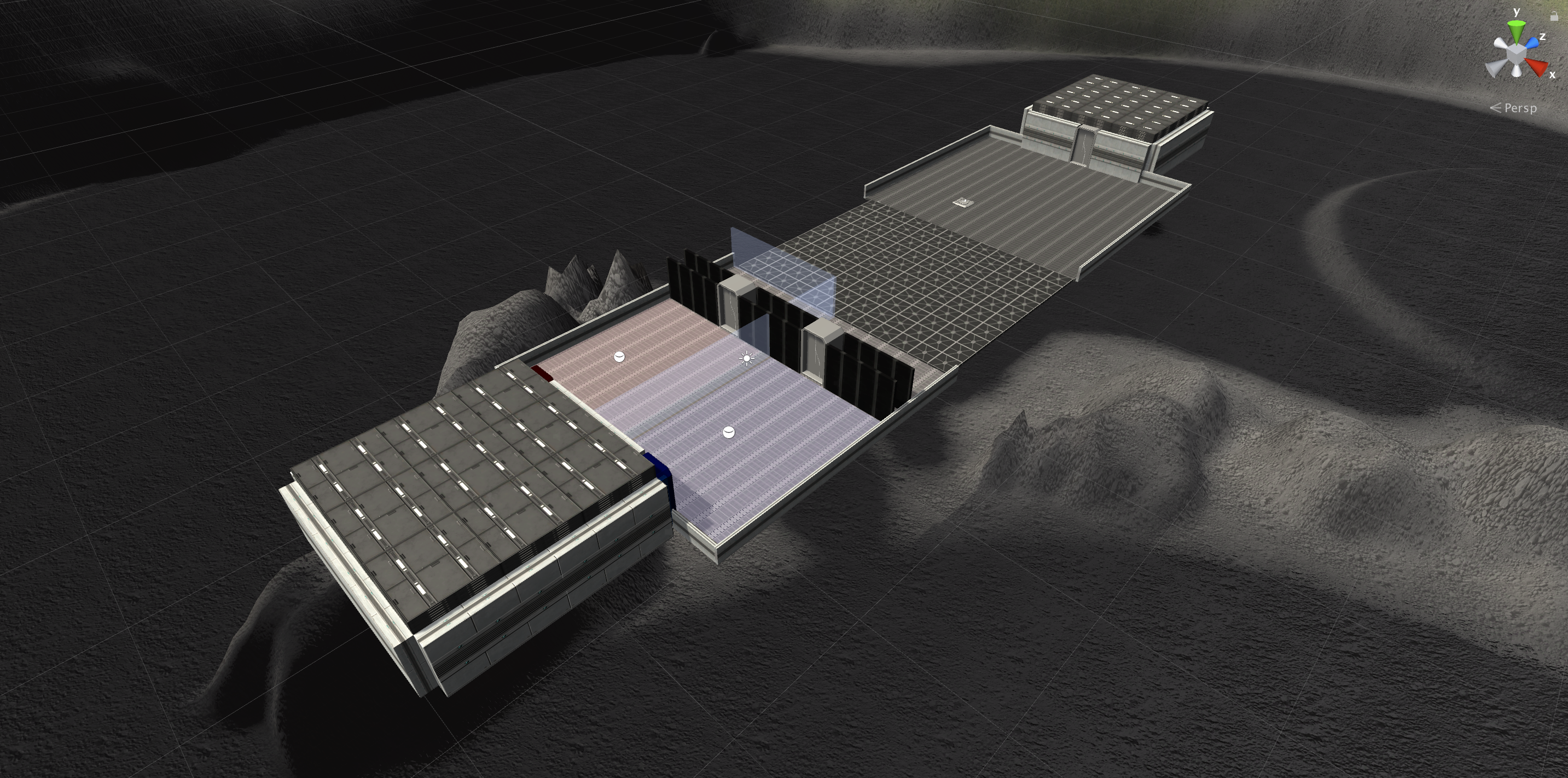
Our first level created for the demo.
The layout of the puzzle. The red player can see the path for the blue player to reach the other side of the stage.
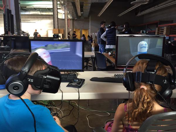
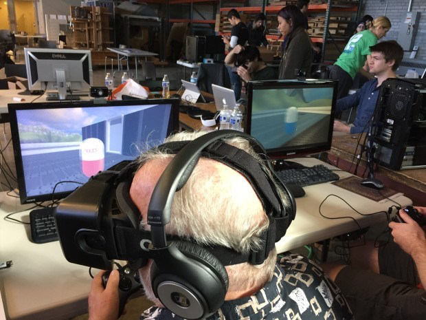
Once levels were designed and the main game mechanics were implemented, had a little time left to condut playtesting with other hackathon attendees. I helped facilitate these playtest sessions and made note of player difficulties and bugs, which would then be addressed as quickly as possible in then next build.
With the time reamining, we got feedback from four participants, two adults and two children. One of the adults and the two children only had limited experience with the Oculus system. These participants certainly struggled learning how to move in the VR environment using the headset and two controllers. We hadn't designed any cues or hints within the game, hoping that the first level was simple enough to understand. While we didn't have time to design the game to be as learnable as possible, I can imagine how to address these issues in future projects through visual or audio cues and effective game design that allows players to explore different options and interactions so that they may learn them.
The hackathon judges liked our concept and prototype though. The themes of collaborative puzzle solving resonated with them, and reminded some people of another VR puzzle game called Keep Talking and Nobody Explodes (KTNE). In KTNE, one player with a VR headset has to diffuse a virtual bomb following the instructions read aloud to them by other players. Players win the game by successfully communicating instructions and cues to diffuse the bomb. PILLars sought to do a similar thing with the theme of communicating visual cues together with another player in the virtual environment. For all of PILLar's flaws, my team and I earned 2nd Place for Best in the Show. Our project was also briefly mentioned in Geekwire.
PESTO (Promoting Education Styles Through Organization) Video Prototype
Project Type:
Web Interface Prototyping
Date:
Autumn 2015
Summary: PESTO (Promoting Education Styles Through Organization) is an imagined tool for helping students find learning resources aggregated across the internet. We conducted short surveys and interviews with current students to guide our design. This was an exercise in using video to demonstrate a prototyped web interface design. On a team of three, I served as a User Experience Designer and User Researcher. I also performed video editing and narration.
The PESTO Database (Promoting Education Styles Through Organization) is a web application mockup designed to aggregate learning resources from across the internet in an open online community. My team and I designed PESTO to allow students who have different learning styles (visual, kinesthetic, and auditory) to find all the resources the need within one convenient space. Our user research in this domain identified that students often have difficulty finding the resources they need, which are often spread across many websites and online resources. The site intends to be a one-stop-shop for video, textual, and practiced-based resources.
I worked on a team of three including myself to conduct user research by the means of a survey and focused short interviews; develop the user flow of PESTO using user-flow diagrams; sketch low-fidelity prototypes of the system; test the system in paper prototype sessions; and then design different screens of the medium-fidelity mockup. PESTO was designed solely as a mockup and is a non-functional website. However, we created a video prototype to simulate a typical interaction with PESTO from the perspective of three different user personas. The video can be viewed below:
Fragments: A Virtual Reality Adventure Into an Experience With Anxiety
Project Type:
Virtual Reality Game Development
Duration:
6 Months, Winter-Spring 2016
Summary: A virtual reality story-driven puzzle game built in Unity3D to represent the experiences of a person experiencing a severe anxiety disorder. On a team of five, I served as an Experience Designer, Level Designer, and User Researcher. I also contributed to the project's writing and narrative.
Fragments is a concept for a virtual reality puzzle adventure game that simulates the symptoms and experiences around severe anxiety disorders. It was produced for my Human Centered Design and Engineering (HCDE) 2016 senior capstone.
Trailer
Background
Generalized anxiety disorder (GAD) is often stigmatized. There are few interactive media forms that focus on themes of anxiety. Of those that do, the vast majority are intended to induce anxiety and provide shock-value without representing an overcoming of such experiences. Fragments is an attempt at representing a fictional experience with anxiety through virutal reality. Using dramatic storytelling and principles of immersion, we aim to present a positive, fantasy adventure about a personal experience of overcoming anxiety. Fragments simulates symptoms of anxiety to help those without it understand these experiences as well as challenge its stigmas. The audience traverses a world rife in metaphor and symbolism that will encourage those with or without anxiety to discuss together.
Project Team and My Role
Five students across both the University of Washington Human Centered Design and Engineering (HCDE) and Informatics majors were involved in the creation of Fragments. I served as the project's level designer and user experience researcher. I also worked on the project's narrative and game mechanics with other designers and engineers.
Research and Design
We consulted existing research into experiences of people with severe anxiety disorders. These experiences include both symptoms of anxiety and the conditions and stigmas faced by those with anxiety.
Symptoms include:
Tunnel vision
Shortness of breath
Severe panic attacks
Rapid heartrate
Negative or intrusive thoughts and worrying
Stigmas toward anxiety take the form of common cultural language and norms used to discourage those with anxiety from seeking help or the medical attention they need. Often those with anxiety are told to "not worry" or are criticized as "overreacting". Often is the case that it is those who do not understand the nature of anxiety disorders that use such language.
During our design process, we brainstormed ways we could simulate such experiences. Fragments would use virtual reality and immersive audio to simulate these experiences as players progress through the story. The character they inhabit face challenges such as unhelpful intrusitve thoughts (represented as disembodied voices) and inhibitions to sight and sound.
We also looked at existing games for inspiration on the topic of mental health and anxiety. Unfortunately, many games are often horror-themed, intended to trigger feelings of anxiety rather than address those feelings. Games like Amnesia: The Dark Descent offer a wealth of inspirations for representing anxiety and fear through visual and audio mechanics and cues (blurred vision, eerie sounds, and hallucinations), but the game is a horror experience designed to evoke reaction and thrill rather than discussion or understanding. Thus, we wanted Fragments to be a positive non-horror, mystery, puzzle-based experience.
We also looked for stylistic inspirations from games such as Journey, which we valued for its art style and emotionally-tinged but soft and approachable mood.
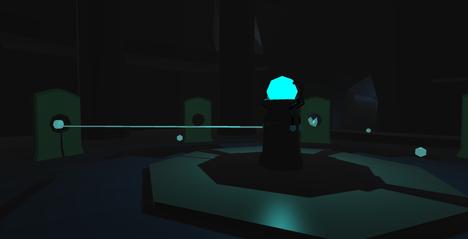
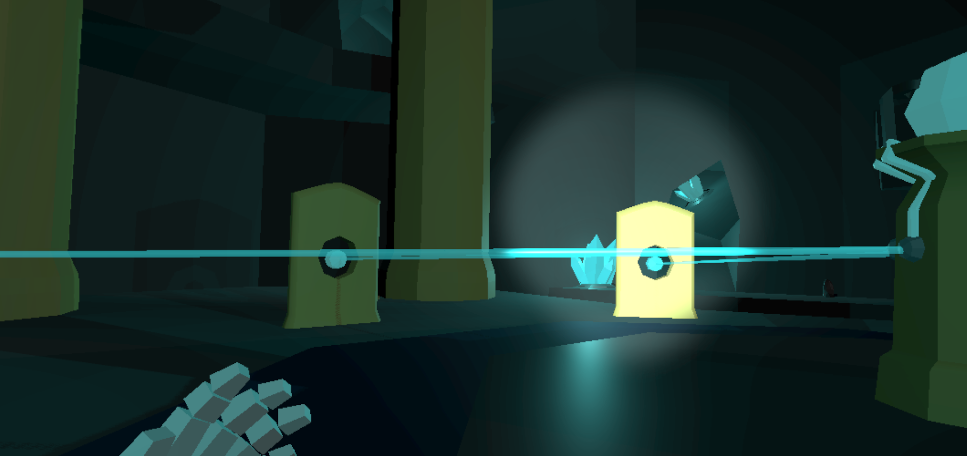
In Fragments, players solve room-based puzzles to advance through the world. Players collect crystal fragments representing shattered memories and use these fragments to activate doors and objects. Cutscenes and other plot elements help reveal the story.
Players use the Vive controllers to move around the world and interact with objects necessary for advancing through the game. The controllers are represented in-world as a magic flashlgiht that helps players navigate dark spaces and activate special objects just by shining light upon them.
Players avoid obstacles and enemies that trigger panic attacks akin to real anxiety symptoms in the player's character. Upon reaching the maximum amount of anxiety, player's vision will black out and the game will reset at a checkpoint.
Concept Pitch Video
Concept Art
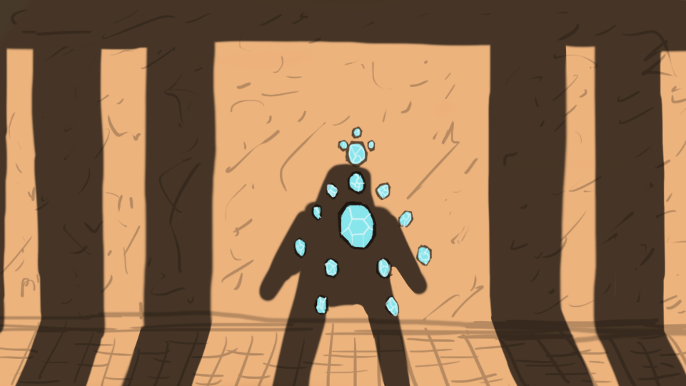
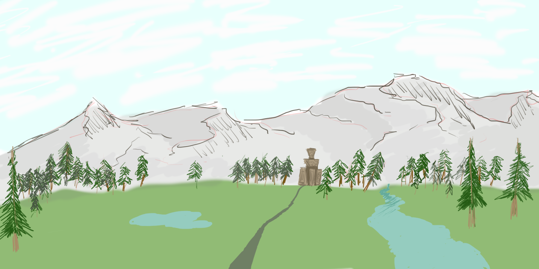
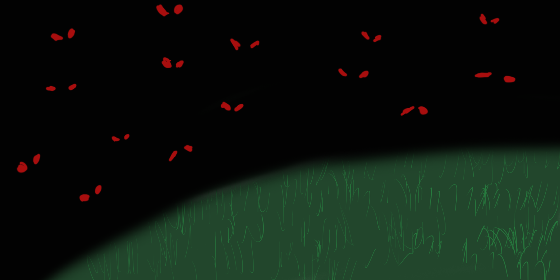
I created a handful of concept illustrations (storyboards and sketches) to brainstorm the mood, environment, key moments, and scenes of Fragments. A small sample can be seen below:
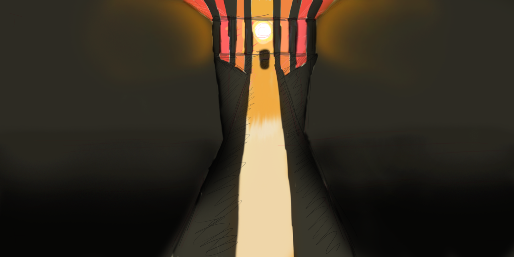
The shadow of the player symbolically fills an arangement of crystal fragments.
Early landscape view.
Early depiction of a monster encounter.
Sunset atmospheric looking out from an interior.
Development
We first created testbed prototypes in Unity and C# to proof level designs and game mechanics. Testing was done with the Vive system. We used both custom and public assets to construct the environment. As a level designer, I created sketches of puzzles and rooms. I also prototyped and developed mood-establishing environments such as wide outdoor vistas and narrow corridors. On occasion, we would create early level and puzzle designs on our team's minecraft server.
As we neared our deadline, we continued to incrementally add and test new features and mechanics as a way to pace our development. Each week was focused on different aspects of the experience.
The demo of Fragments was finished in May 2016 and presented at both the Informatics and Human Centered Design Design and Engineering capstones.
Screenshots
Fragments adopted a low-poly art style to save time on design and resources, but to also express the game's fantasy setting and positive mood and atmosphere approach it takes to dealing with the topic of anxiety and mental health. Here are two screenshots of the interior environment of one of the puzzles.
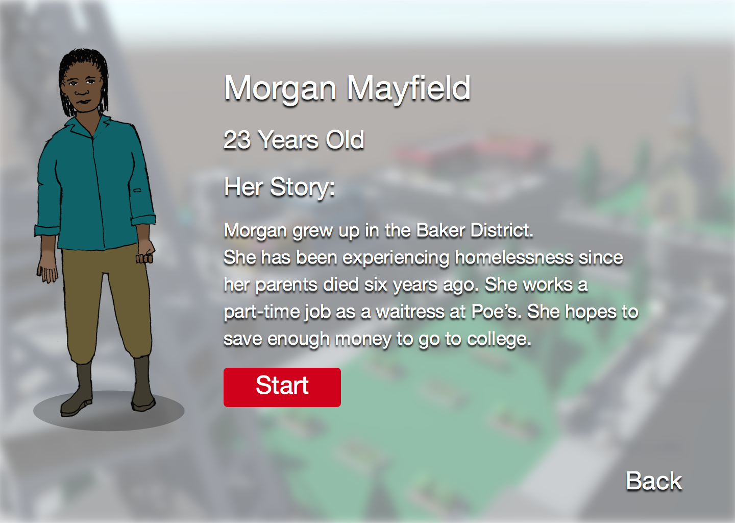
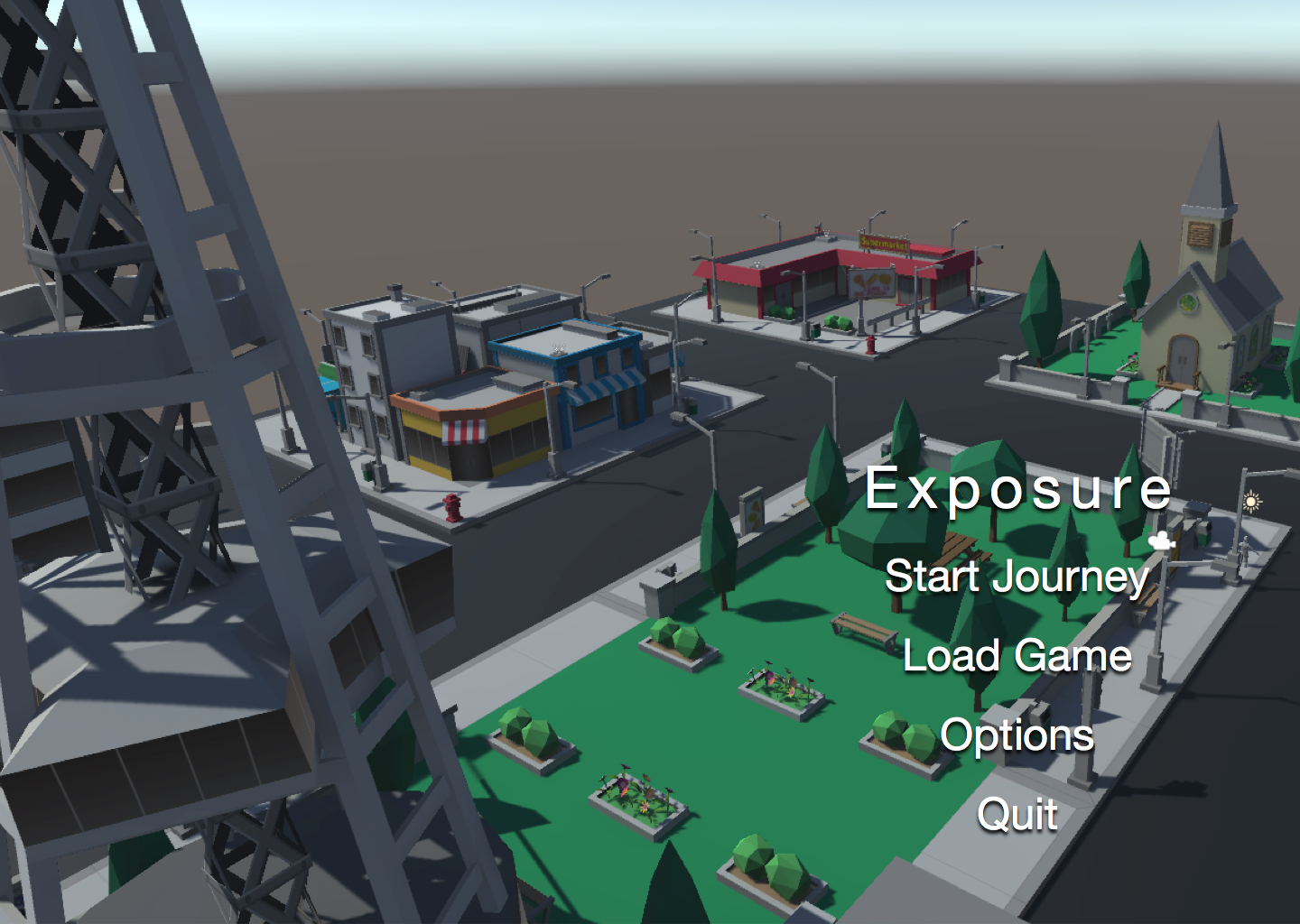
Exposure: A 3D Interactive Narrative About Homelessness
Project Type:
Unity Interactive Narrative Development
Duration:
6 Months, Winter-Spring 2016
Summary: An interactive narrative built in Unity3D to represent the stories and experiences of Seattle's young homeless population. On a team of four, I served as the Project Manager, Experience Designer, and Writer. For our work, my team won the Information School 2016 Capstone Diversity Award for using software in a creative way that aims to address issues of inclusion and justice.
What is Exposure?
Exposure was my Informatics 2016 capstone project that used interactive digital storytelling to represent the experiences of homeless youth around the University of Washington. It [Exposure] took the form of a third-person roleplaying narrative that allowed an audience of University of Washington students to step into the shoes of a fictional homeless young person. Seattle’s young homeless population has long been underrepresented—their stories are largely absent from public conscious. In the University District, young people often face discrimination, stereotypes, and violence from University of Washington students rooted in unaccountable misperceptions. The audience interacts with a cast of characters within vignettes based upon stories curated through community-grounded research.
Project Goals
By exposing our audience to this community, students were encouraged to confront prevailing misperceptions of young people, develop empathy for them, and engage with movements addressing causes of homelessness. Just as film and literature can communicate lived experiences and motivate social change, the use of an interactive medium would be a novel approach to represent a community long neglected. The goal of this project was to create a proof-of-concept demo within six months of the inital project start date to showcase the opportunities interactive stories present for motivating social change. We aimed to have an demonstratable vision for a narrative and interactive gameplay.
Below is the trailer for Exposure created using in-game and live-action footage.
Inspirations
One of our key inspirations was Brandon Stanton's acclaimed blog series, Humans of New York (HONY). Stanton captured snapshots of everyday people living in New York City and often attributed a small story or vingette of their experiences. Humans of New York was noted to inspire its audience to step into shoes and empathize with the experiences of people they would otherwise never interact with. In some cases, HONY has inspired social fundraising campaigns to support people and communities in need.
In Seattle, a similar blog called Facing Homelessness is run by Rex Hohlbein, a local architecht and activist. Facing Homelessness has similar goals as HONY: to represent the stories and experiences of people experienceing homelessness in the greater Seattle area and inspire empathy and respect toward this community. Hohlbein and his small team gather stories from people living on the streets and share them on Facebook and other social media sites. Exposure's goal inspired by HONY and Facing Homelessness: to encourage empathy through storytelling that motivates social engagement and change by representing the experiences of others normally ignored or forgetten in the public eye.
Why a Game?
According to cognitive psychologist Jim Gee, comprehension of complex ideas is grounded in perceptual simulations people are capable of running in their minds. Interactive visual media like games can aid us in forming those perceptions by providing us a visual-interactive framework by which to base those simulations on. As someone who is interested in using games to tell stories that discuss and challenge ongoing social issues, games provide a unique opportunity to allow its audience to step into the narrative shoes and experiences of others.
Story-driven games such as Life is Strange incorporate themes such as bullying, domestic violence, drug addiction, and sexual assault into its overaching narrative, but are not the main focus of the story. There are games such as Spent that attempt to simulate the experiences of homelessness to their audience. Spent's gameplay simulates financial management in difficult circumstances as a way to show how people may enter homelessness. However, Spent does not use visual representations of homelessness or portray characters experiencing homelessness for the audience to connect with. The game was instead criticized for being a game of money management rather than about other challenges and barriers associated with homelessness such as domestic violence, drug abuse, and gender and racial discrimination.
We Are Chicago is an upcoming story-driven, Telltale-style game set in the African American community living in South Side, Chicago during the 1980s and 90s. It's developer, Culture Shock Games, conducted extensive interviews with people living in South Side to currate experiences by which to understand the experiences of African Americans living in South Side and develop a compelling and respectful story from those experiences. It aims to tell stories of this community during the height of intense crime, poverty, institutional racism, and unrest that lives on today. We Are Chicago not only aims to engender empathy within its audience but also encourage them to engage with current initiatives to combat crime and poverty in South Side. Culture Shock Games plans on donating a percentage of revenue to community groups and services in South Side. My team and I look to We Are Chicago as a potential model for interactive, narrative-driven games for social engagement. It uses community-grounded research to better represent its subjects in an interactive, visual medium that allows players to step into the shoes of others.
Project Team and My Role
To create Exposure, I worked as the project manager with three other core team members (two developers and one user experience designer). We were also joined by two volunteer 3D modelers, friends who helped us create custom character models and assets. As the project manager, I set my team's weekly agenda and worked with my team members to define the project's scope and key milestones. I also served as the creative director and game designer, looking into what 3D engine, mechanics, and assets were needed.
At the beginning of the project, we experimiented with different systems for task management and communication. We experimented with Trello, Slack, and Asana beofre settling on Asana for it's great user interface and simple to read and responsive task lists. Asana allowed us to list all the features and functions we wanted to incorporate into Exposure and check each off upon completion.
Community-Grounded Research
To create an accurate story that respects the experiences and struggles faced by young homeless people, we conducted community-grounded research as a understand their community and know how they want to be portrayed. By meeting with community leaders, speaking with secondary ethnographic researchers, and volunteering at local community service shelters, we had a framework by which to create a series of vingettes of key experiences and a fictional narrative with a full cast of well-representative characters across many backgrounds. We even met with Rex from Facing Homelessness to understand his work as a third party source for currated stories.
Through our research, we learned about factors that drive young people into homelessness, wether it be family violence and discrimination against sexual orientation or multigenerational poverty and inadequate mental healthcare. We learned about day-to-day street interactions that young people on the streets face such as physical violence from pedestrians, intimidation from the police, sexual abuse, and casual street harassment. We learned that cellphones, smartphones, and music were important elements of young homeless peoples' lives, allowing them to stay connected with each other, structure their daily activites, find entertainment, and most importantly relax during times of stress.
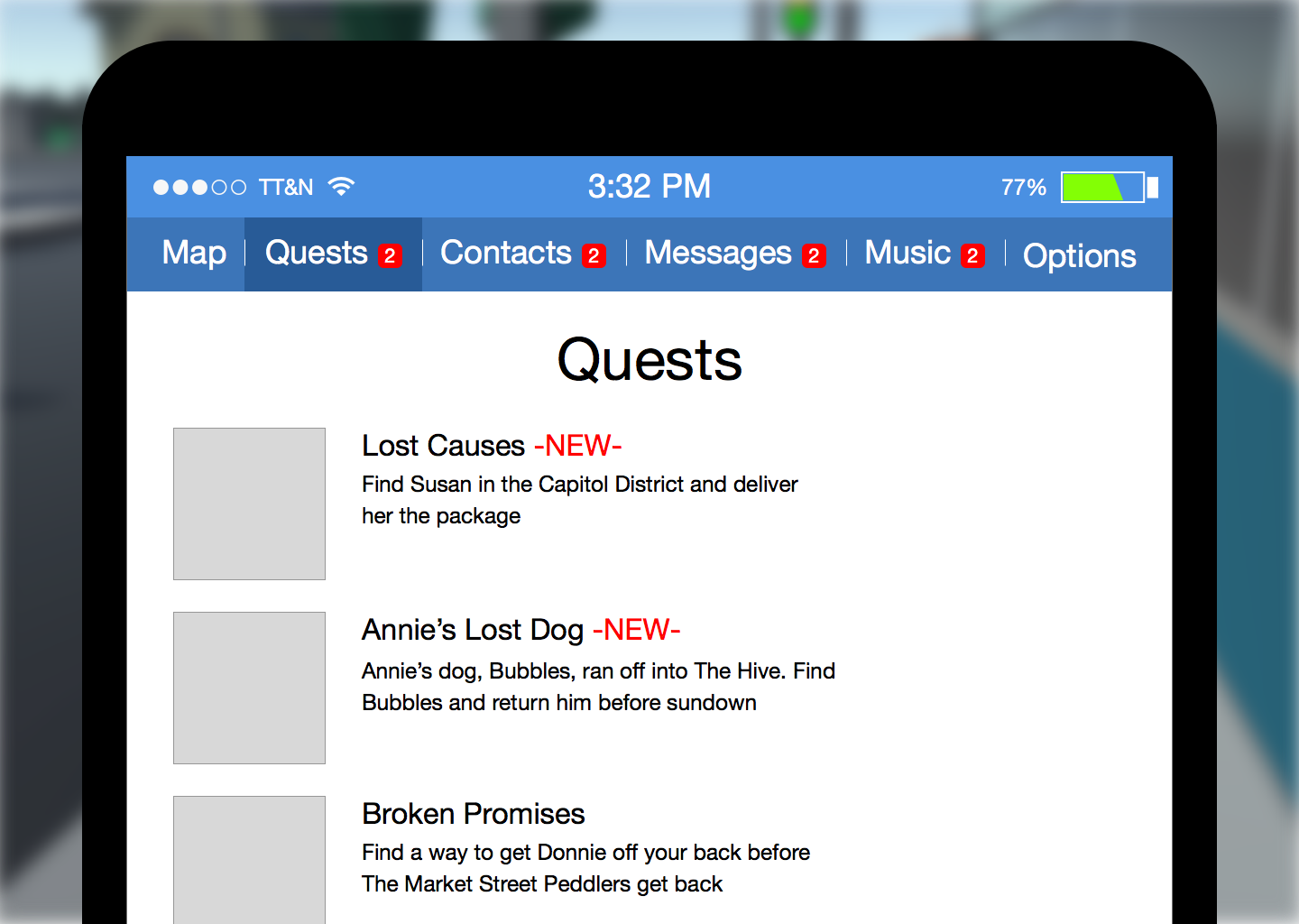
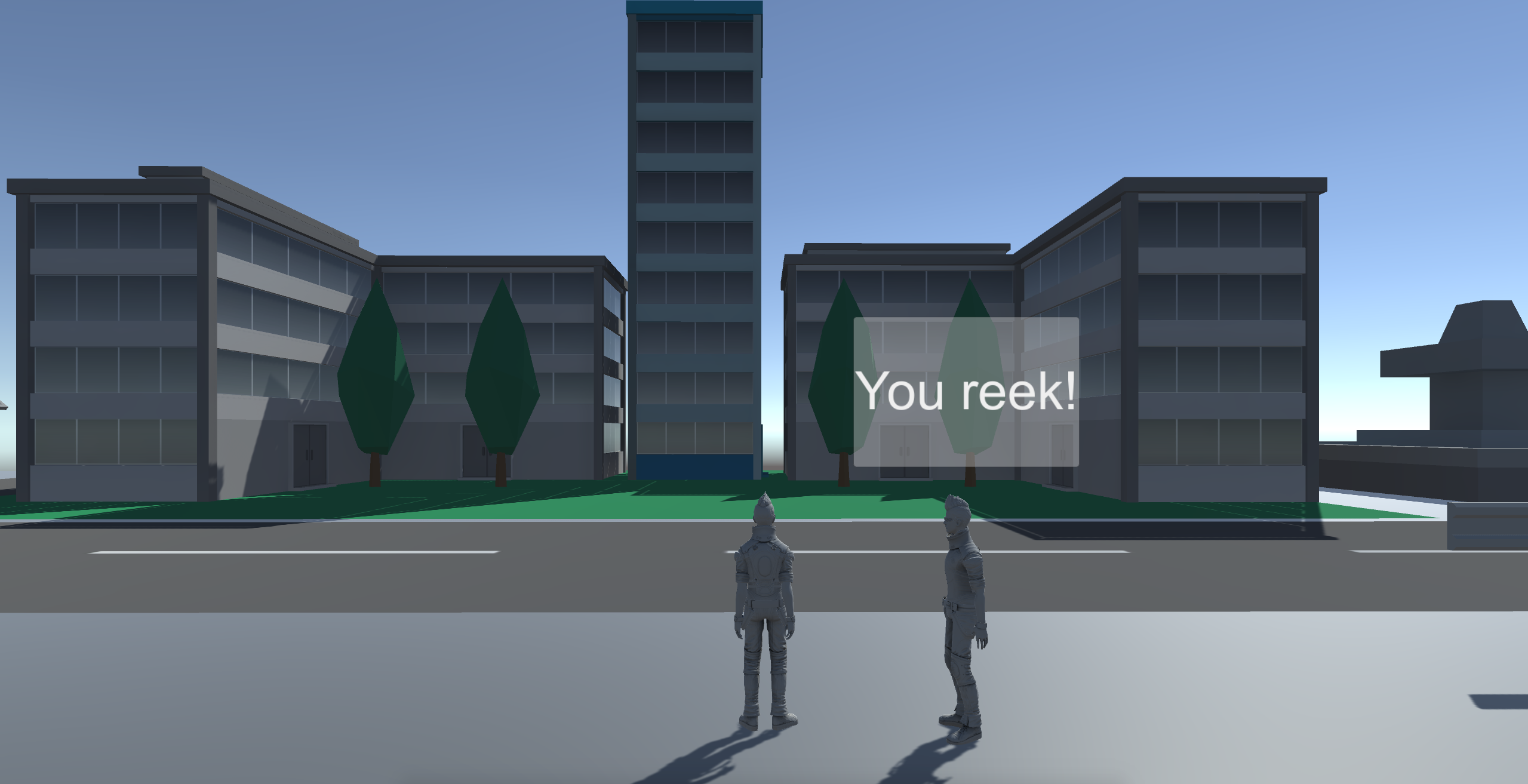
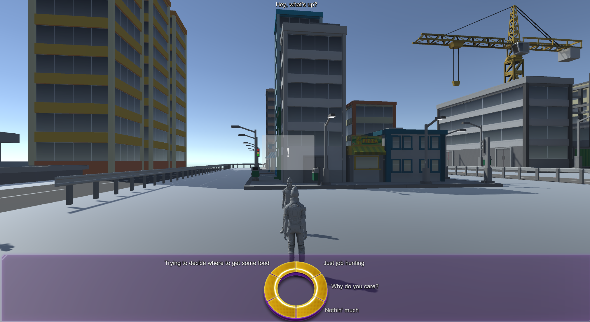
Our findings are represented in Exposure through in-world events, landmarks, interactions, and mechanics. Critical events and plot points draw from the stories of real people. Players use an in-world smartphone to listen to music, check reminders (quests) on ongoing storylines, among other things. Characters will have their mood affected by episodes of violence or street harassment. Important community hubs in the fictional world of Exposure would be based off of real feedback from the community.
The community itself, being made up of young people who have experience playing video games, was very interested and excited to hear how a story of people like them could be told through an interactive medium.
Design and Development Process
Interaction Design
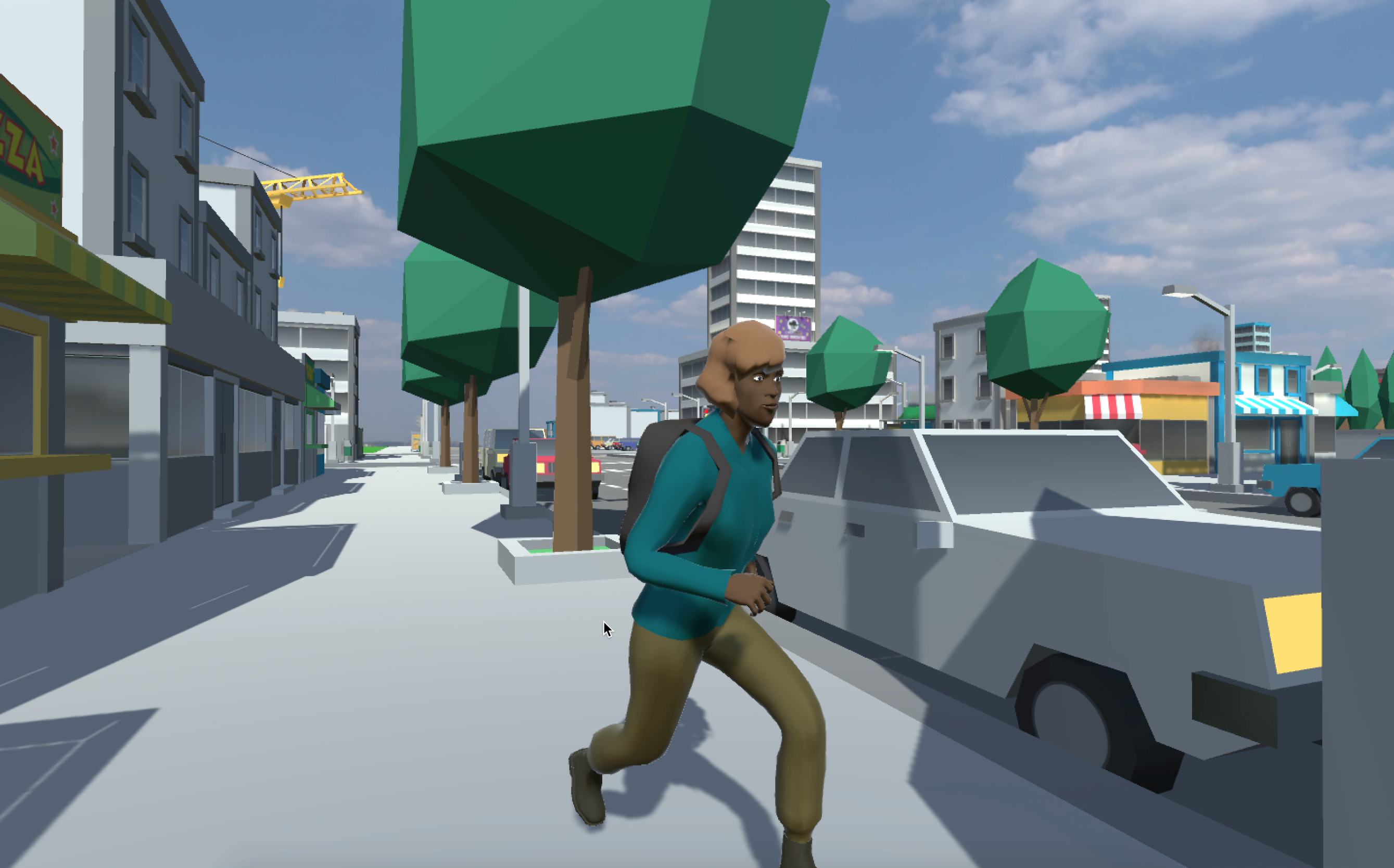
Exposure is built as a third-person adventure-style roleplaying narrative where the audience takes the role of one of many fictional characters experiencing homelessness. Because it is a PC game, we looked to game industry standards for third-person controls. This means 'W A S D' for movement and the use of a mouse for a camera pan. We modeled Exposure on the controls of successful games like Metal Gear Solid: The Phantom Pain and Life is Strange, both of which use this scheme. Using existing standards for game controls helped us save time in deciding on interaction mechanics.
Drawing from our research findings, we designed the in-game smartphone as a menu and hub for players to manage the aformentioned features (reminders, music, map, etc). Non-player characters (NPCs) in the narrative such as pedestrians, police officers, or other people living on the streets can either ignore, verbally harass, or support the player character as they travel through the environment. If a player character's mood becomes too low, they may suffer from debilitating anxiety which affects how they interact with other characters or severely hinder their progress in the story.
Players can also use an in-game corner minimap to check where story objectives and interactive events are.
Character Design
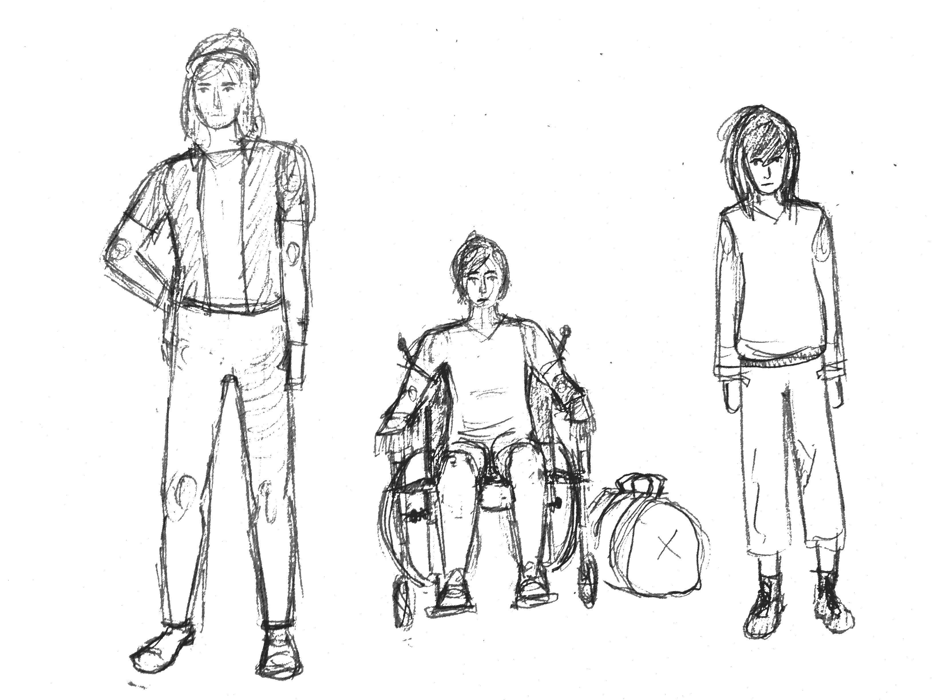
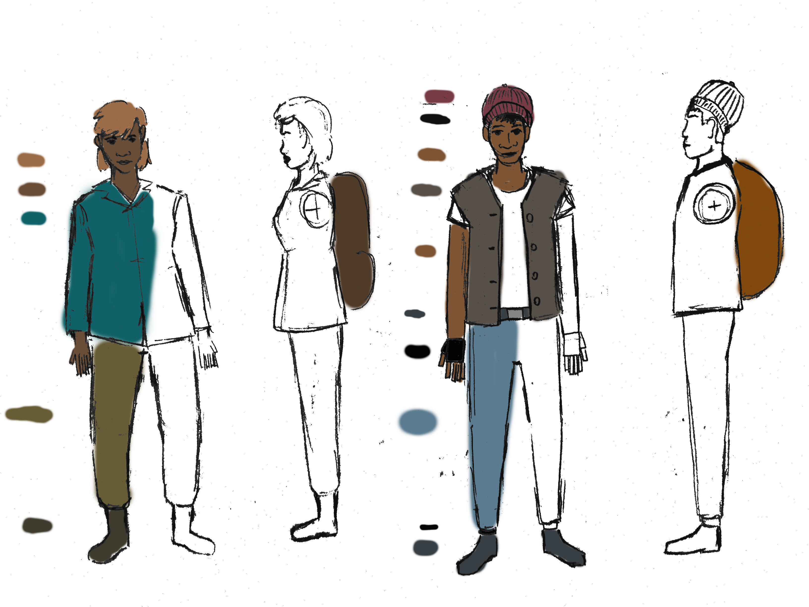
Characters were designed to reflect the diversity of the youth community. The conceptual plan called for characters who represented different ethnic groups and abilities. We sought to develop characters with both visibile and invisible disabilities but time constraints only allowed us to focus on African American, Latino, and Navtive American characters, groups which compose a large fraction of the youth population in Seattle. Clothing and color schemes of different characters harken back to the creativity and electic style and fashion worn by local residents.
Characters representing different race and ability
Static images and color guides assisted modeling and animation
Concept Artwork and Design
I worked on illustrations that sought to capture the mood/tone, look, and feel of Exposure. Much of this exporatory concept work was organized into an Invision Moodboard which can be seen here
Detailed storyboards and medium-fidelity frames from conceptual animated cutscenes were created to bring Exposure as close to a real visual narrative experience as possible.
I used Sketch3 to create mockups of in-game menus, title screens, and character selection menus.
We also created functional mockups to familiarize ourselves with Unity's functions and features, as well as prototype and test out our desired mechanics and features.
Testing and Design Evaluation
Concept artwork, paper and medium-fidelity prototypes, and functional mockups were used early user studies with student participants to evaluate the usability of our interface and interactions. We tested with a small sample of both experienced and inexperienced video game players. The results from five brief studies allowed us to make positive changes to the in-game interface and interaction design.
The senstivity of the mouse-controlled free-view camera was reduced after players reported that it was too fast and disorienting. We were able to identify bugs in the dialogue and quest systems and correct those immediately. Areas of the map where geometry caused performance problems were fixed. Players were also looking for cues to inform them they could interact with certain objects in the world. Minimap icons were enlarged after others had issues finding locations on the map.
Unity Development
After we knew what story elements, mechanics, and features we would be building into the story, my two developers and I began the development phase of Exposure in Unity3D. We began by taking what we learned from experimenting in our prototype environment and implementing them into a master build. We began with character controls and then built an early version of the in-world environment for players to roam around.
We reached out to community-made prefabricated objects and assets available to us on the Unity Store. Dragging and dropping ready-made buildings, trees, roads, and objects simplified an otherwise daunting task of populating our fictional world with life and scenery.
Scripts allowed us to create mechanics and functions such as menus and a system to track the mood and wellbeing of the player character. With the clock ticking to capstone and our limited experience with Unity and C# as a whole, our code was not the best optimized or elegantly planned. We traded immediate functionality over elegance and efficiency. This was of course a proof-of-concept. Thankfully, Unity and Exposure itself was light enough as an engine to run smoothly even on a Macbook Pro 2014.
In the final stages of development, I took it upon myself to create a brief storyboard for a cutscene to serve as an introduction to the main storyline. I then added music, voice acting, and sound effects to the scene and compiled it into a video. By this time, capstone was only a day away and I could not integrate it into Unity in time for the release. It instead lived on as a Youtube video for others to view separately.
Challenges
Early in the project, we struggled with what Exposure wanted to be. The idea of creating a game, an interactive narrative, was unheard of in our capstone class. With only six months to begin and complete capstone, tt was easy to see how daunting a task of creating a functional game was when the industry, rife with competition, would see hundreds of games fail to turn success every year. None of us knew at first how to even start Unity, let alone create C# scripts and integrate custom character models. Further, it was unclear how such an interactive story could immediately benefit or serve a cause that demands immediacy. Exposure could have been a mobile application or a website redesign, SEO, and content strategy project for a local service organiation. When discussing our goals, I told my team we wanted to do something novel and unique, to use information and stories of experiences told through interactivity as a way to speak to the experiences of others. Exposure at it's core was an exploration of possibilities, of potential, in a time when the demand for games with similar themes is on the rise. Knowing this helped us focus on the project at hand and feel confident in ourselves to create a piece of interactive software that can be more than just an artpiece for a portfolio.
Later in the project, we realized that there wasn't enough time to implement every feature and detail we hopped for. I immediately made cuts to things like multiple open-world environments and dialogue options. Being a proof-of-concept, we didn't need those additional features, but it would have been nice.
Results
Exposure had a functional demo by May 26th, 2016. We were able to finish one open world environment with a small set of custom character models, a collection of community-developed prefabs, and a library's worth of poorly optimized scripts and code. There were two small quests, music to play, NPCs to run into, and even a mock cutscene.
For our work, my team won the Information School 2016 Capstone Diversity Award for using software in a creative way that aims to address issues of inclusion and justice.
Reflections
To me, Exposure was a proof of concept that games can be a great medium for expression of political and social views. If there was more time to put into it, the story would have an immense amount of visual and narrative polish. There could have been more susbtantial quests and story elements incorporated into the demo, and fully-voiced dialogue was not far from being an option.
Further, I feel that it would be important for future games and stories about the experiences of people outside of my own experiences to include said people directly in the writing and development of those interactive stories. University of Washington's Human Subjects Code prevented us from directly reaching out to the community members without a lengthy study approval process. And with only six months to work on the project, there was no time-sensitive way to develop the planning and logisitics for such cross-involvement. However, on larger projects with longer terms, I see that there could be potential for the involvement of the represented community.
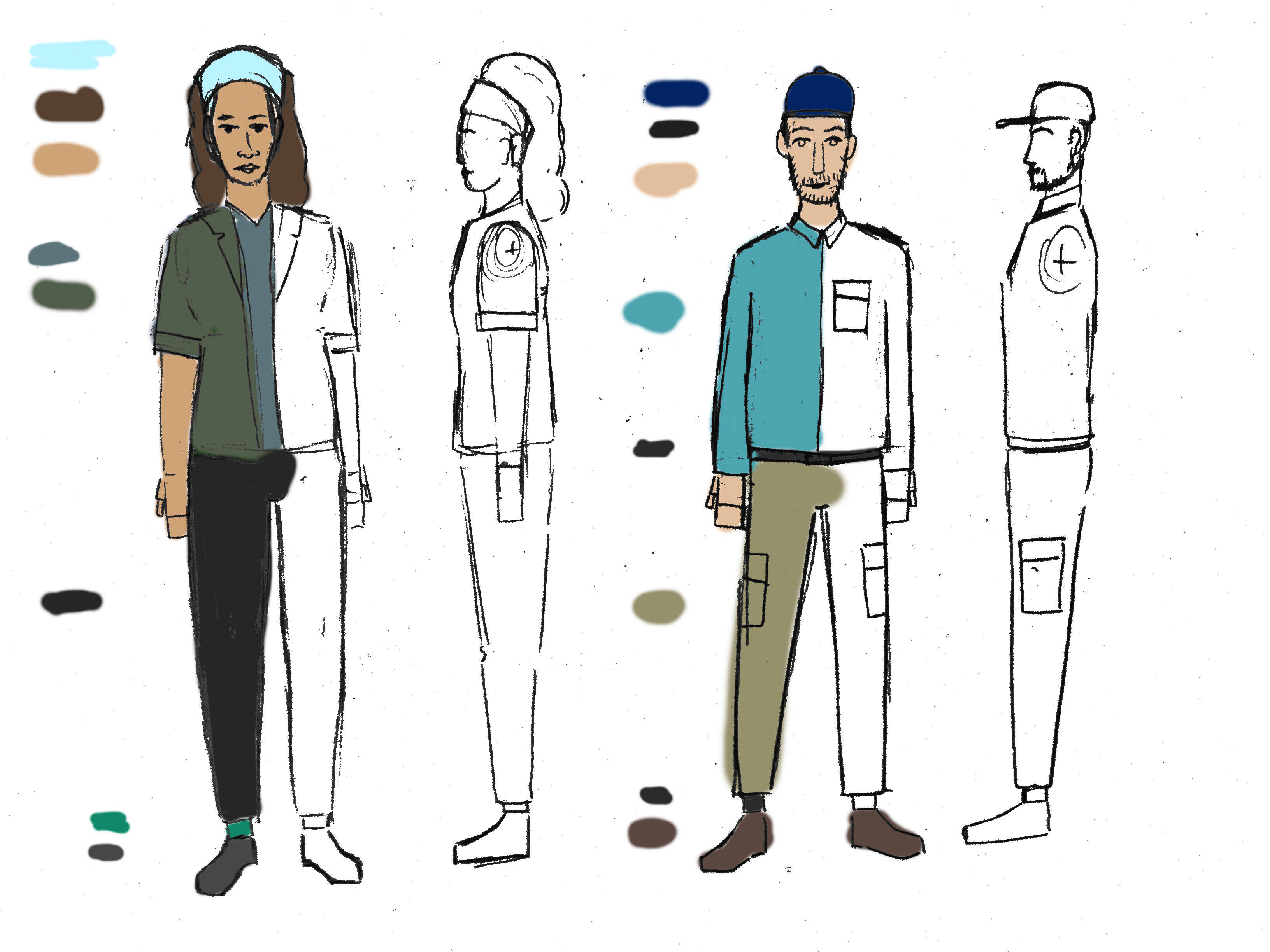
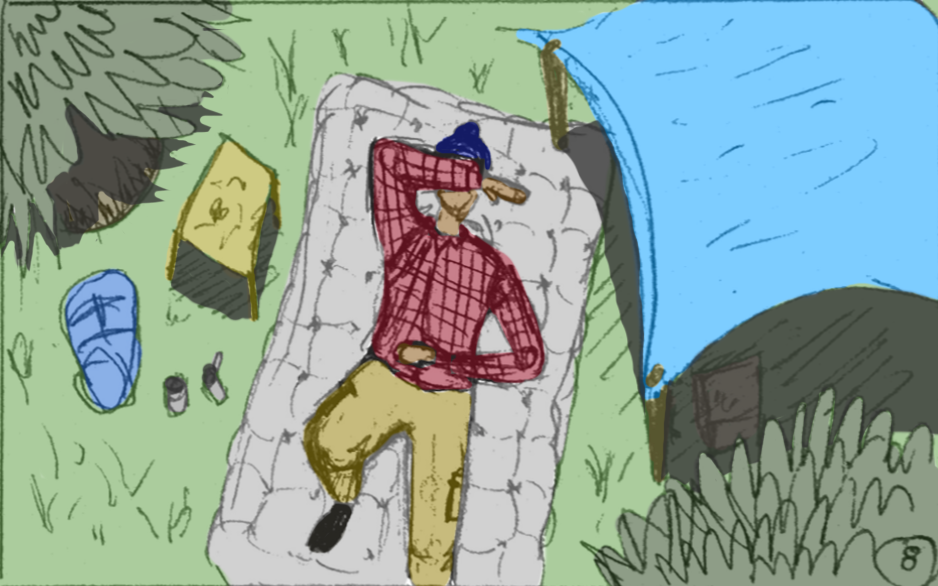
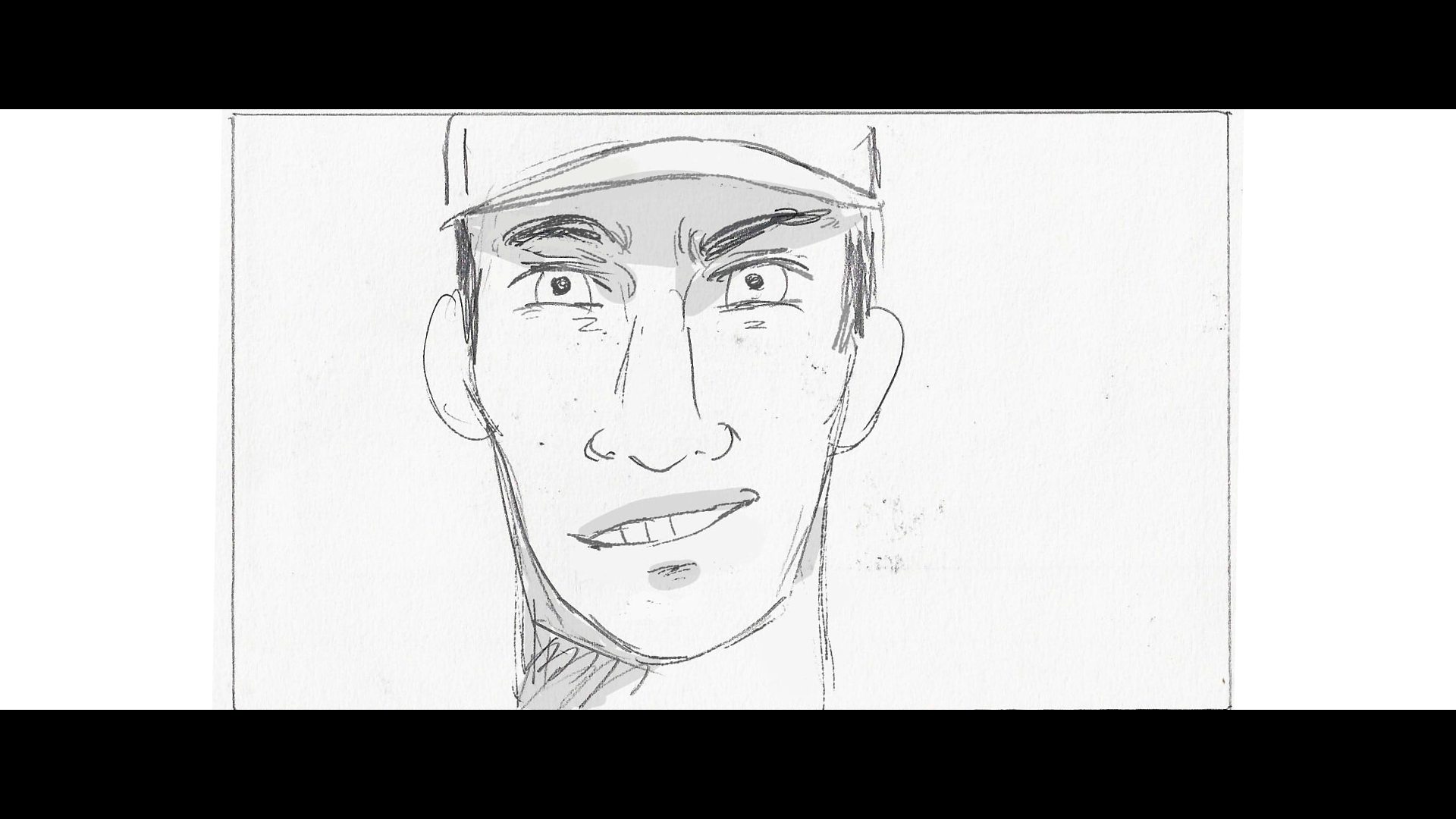
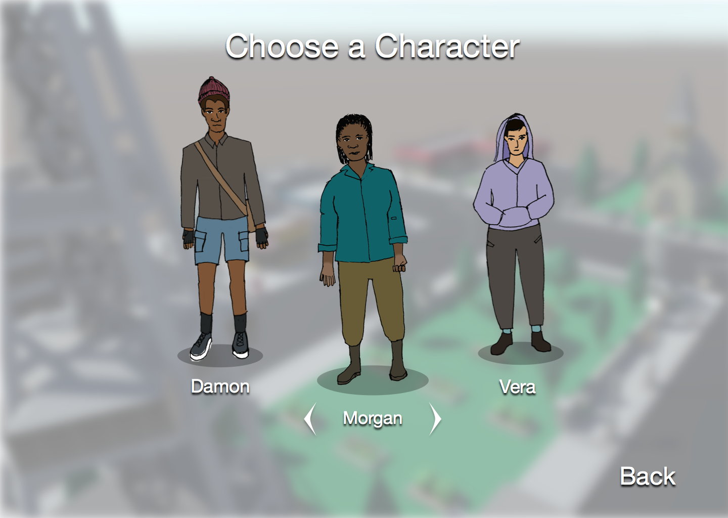
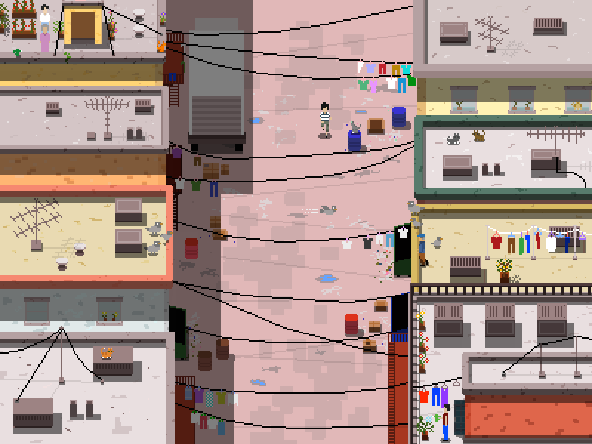
Illustrations
In my spare time, I enjoy practicing traditional and digital illustration as part of my design and artistic skills. Since graduation from the University of Washington, I've been spending more and more time trying different mediums and tools. I maintain multiple sketchbooks where I practice architechture, landscape, and character design drawings. I also create pixel art and pixel art animations using Adobe Photoshop, a few of which you can see below. To view more of my work, please visit my art blog.